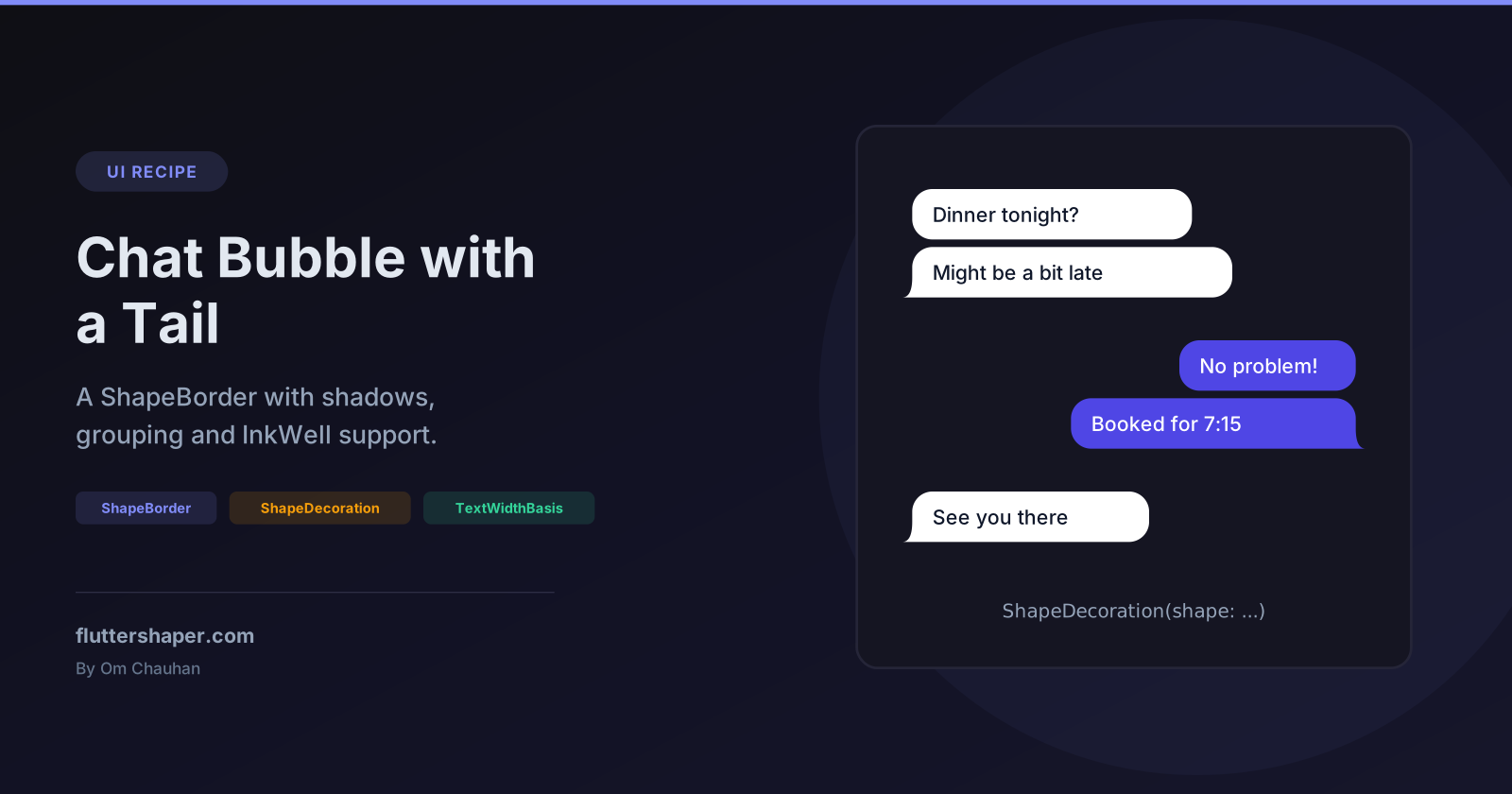
Flutter Chat Bubble with a Tail: a Reusable ShapeBorder
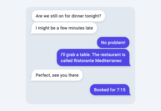
A chat screen needs one shape in four variations: incoming or outgoing, with or without a tail. It also has to fit its text, cast a shadow that follows the tail, and line up neatly when the same person sends several messages in a row.
Writing the bubble as a ShapeBorder gets most of that from widgets you already use. Container and ShapeDecoration give you the fill, the shadow and the padding, and Material with InkWell gives you ripples and long-press handling clipped to the bubble. No packages are needed.
Why a ShapeBorder
You could draw a bubble with a CustomPainter or cut a Container with ClipPath, but each loses something. A painter doesn't size itself to text, and a clip cuts off the shadow. A ShapeBorder is just a description of an outline, and ShapeDecoration, Material, Card and InkWell all know how to fill it, shadow it and clip to it. CustomPainter vs ClipPath vs ShapeBorder compares the three in detail.
Step 1: the bubble shape
The border builds the outgoing shape (tail at the bottom right) and mirrors it for incoming messages:
import 'dart:math' as math;

import 'package:flutter/material.dart';

class ChatBubbleBorder extends ShapeBorder {
  const ChatBubbleBorder({
    this.outgoing = true,
    this.showTail = true,
    this.radius = 18,
    this.tailWidth = 8,
  });

  final bool outgoing;
  final bool showTail;
  final double radius;
  final double tailWidth;

  // Space for the tail. Container adds this to its padding automatically.
  @override
  EdgeInsetsGeometry get dimensions =>
      outgoing ? EdgeInsets.only(right: tailWidth) : EdgeInsets.only(left: tailWidth);

  @override
  Path getOuterPath(Rect rect, {TextDirection? textDirection}) {
    // Build the outgoing shape (tail bottom-right), then mirror it for incoming.
    final body = Rect.fromLTRB(rect.left, rect.top, rect.right - tailWidth, rect.bottom);
    final r = math.min(radius, body.shortestSide / 2);
    final corner = Radius.circular(r);

    final Path path;
    if (showTail) {
      path = Path()
        ..moveTo(body.left + r, body.top)
        ..lineTo(body.right - r, body.top)
        ..arcToPoint(Offset(body.right, body.top + r), radius: corner)
        ..lineTo(body.right, body.bottom - r)
        // The tail: curve out from the right edge to a point at the bottom.
        ..quadraticBezierTo(body.right, body.bottom, rect.right, body.bottom)
        ..lineTo(body.left + r, body.bottom)
        ..arcToPoint(Offset(body.left, body.bottom - r), radius: corner)
        ..lineTo(body.left, body.top + r)
        ..arcToPoint(Offset(body.left + r, body.top), radius: corner)
        ..close();
    } else {
      path = Path()..addRRect(RRect.fromRectAndRadius(body, corner));
    }

    if (outgoing) return path;
    // Mirror across the vertical centre line of rect.
    final mirror = Matrix4.translationValues(rect.left + rect.right, 0, 0)
      ..scaleByDouble(-1, 1, 1, 1);
    return path.transform(mirror.storage);
  }

  @override
  Path getInnerPath(Rect rect, {TextDirection? textDirection}) =>
      getOuterPath(rect, textDirection: textDirection);

  @override
  void paint(Canvas canvas, Rect rect, {TextDirection? textDirection}) {}

  @override
  ShapeBorder scale(double t) => ChatBubbleBorder(
    outgoing: outgoing,
    showTail: showTail,
    radius: radius * t,
    tailWidth: tailWidth * t,
  );

  @override
  bool operator ==(Object other) =>
      other is ChatBubbleBorder &&
      other.outgoing == outgoing &&
      other.showTail == showTail &&
      other.radius == radius &&
      other.tailWidth == tailWidth;

  @override
  int get hashCode => Object.hash(outgoing, showTail, radius, tailWidth);
}
How it works
The tail lives in a reserved strip. The rounded body takes the full rect minus tailWidth on the tail side, and the tail sticks out into that strip. dimensions tells widgets about the strip: ShapeDecoration.padding returns the shape's dimensions, and Container adds the decoration's padding to its own. A widget test confirms the text in an outgoing bubble ends 14 + 8 px from the bubble's right edge and starts 14 px from its left, with no extra code.
The tail is one quadratic curve. It starts on the right edge one corner radius above the bottom, uses the bottom-right corner of the body as its control point, and ends at the tip in the bottom-right corner of the rect. A Bézier curve leaves its start heading towards its control point and arrives at its end from the control point's direction (how Bézier curves work explains why), so the tail continues the straight right edge smoothly and finishes flat along the bottom.
Bubbles without a tail keep the strip. With showTail: false the body is a plain rounded rectangle of the same width, so a group of bubbles from one sender has one straight edge. In the screenshot, the bubbles above each tail line up with it.
The radius is clamped. A one-line bubble can be shorter than two corner radii. math.min(radius, body.shortestSide / 2) keeps the corners from overlapping.
Mirroring uses a matrix. Instead of a second set of coordinates, incoming bubbles flip the outgoing path around the rect's centre line with Matrix4 (scaleByDouble because the older scale method is deprecated in the vector_math version that ships with Flutter 3.38). A test compares the two shapes at 12,000 points across a 200 × 60 bubble and finds the incoming one is the exact mirror image of the outgoing one.
== and hashCode are worth the lines. ShapeDecoration compares its shape with ==, and RenderDecoratedBox skips repainting when the new decoration equals the old one. Without them, every rebuild with a new ChatBubbleBorder(...) counts as a change.
getInnerPath returns the same path because the border draws no stroke, and paint is empty for the same reason.
Step 2: a bubble that fits its text
class ChatBubble extends StatelessWidget {
  const ChatBubble({
    super.key,
    required this.text,
    required this.outgoing,
    this.showTail = true,
  });

  final String text;
  final bool outgoing;
  final bool showTail;

  @override
  Widget build(BuildContext context) {
    final maxWidth = MediaQuery.sizeOf(context).width * 0.75;
    return Align(
      alignment: outgoing ? Alignment.centerRight : Alignment.centerLeft,
      child: ConstrainedBox(
        constraints: BoxConstraints(maxWidth: maxWidth),
        child: Container(
          padding: const EdgeInsets.symmetric(horizontal: 14, vertical: 9),
          decoration: ShapeDecoration(
            color: outgoing ? const Color(0xFF4F46E5) : Colors.white,
            shape: ChatBubbleBorder(outgoing: outgoing, showTail: showTail),
            shadows: const [
              BoxShadow(color: Color(0x22000000), blurRadius: 6, offset: Offset(0, 2)),
            ],
          ),
          child: Text(
            text,
            textWidthBasis: TextWidthBasis.longestLine,
            style: TextStyle(
              fontSize: 15,
              color: outgoing ? Colors.white : const Color(0xFF0F172A),
            ),
          ),
        ),
      ),
    );
  }
}
Three things control the width:
Alignloosens the constraints. AListViewgives each child the full width;Alignlets the bubble be narrower and pushes it to the correct side.ConstrainedBoxcaps it at 75% of the screen.MediaQuery.sizeOfonly rebuilds the bubble when the size changes, not on everyMediaQuerychange. If your chat sits in a side panel rather than full-screen, use aLayoutBuilderand take 75% ofconstraints.maxWidthinstead.TextWidthBasis.longestLineremoves the slack. By default aTextthat wraps reports the full width it was offered, even when its longest line is shorter, so wrapped bubbles all come out at the maximum width with a gap on the right.
The last point is easy to miss. In a widget test on a 400 px wide screen (so a 300 px maximum), "I'll grab a table. The restaurant is called Ristorante Mediterraneo" wraps onto two lines. With the default TextWidthBasis.parent the bubble is exactly 300 px wide; with longestLine it's 260.5 px and hugs the text. A one-word reply such as "Hi" produces a bubble about 51 px wide; single-line text only takes the width it needs under either setting, according to the TextWidthBasis docs.
The shadow
ShapeDecoration.shadows paints each BoxShadow using the shape's getOuterPath, so the shadow follows the tail. A small blur and offset with low opacity (0x22000000 is black at about 13%) reads as a soft lift rather than a heavy drop shadow. Because the shadow belongs to the decoration and not to a clip, nothing cuts it off, which is the problem described in Flutter ClipPath removes your shadow.
Step 3: grouping consecutive messages
A common convention is to show the tail only on the last bubble of a run from the same sender, with less space between bubbles inside a run:
class Message {
  const Message(this.text, {required this.outgoing});
  final String text;
  final bool outgoing;
}

/// Only the last bubble of a run from the same sender gets a tail.
bool isLastInGroup(List<Message> messages, int i) =>
    i == messages.length - 1 || messages[i + 1].outgoing != messages[i].outgoing;

class ChatList extends StatelessWidget {
  const ChatList({super.key, required this.messages});

  final List<Message> messages;

  @override
  Widget build(BuildContext context) {
    return ListView.builder(
      padding: const EdgeInsets.all(12),
      itemCount: messages.length,
      itemBuilder: (context, i) {
        final last = isLastInGroup(messages, i);
        return Padding(
          padding: EdgeInsets.only(bottom: last ? 12 : 3),
          child: ChatBubble(
            text: messages[i].text,
            outgoing: messages[i].outgoing,
            showTail: last,
          ),
        );
      },
    );
  }
}
For the messages incoming, incoming, outgoing, incoming, outgoing, outgoing, a test confirms isLastInGroup returns false, true, true, true, false, true.
A common chat layout uses ListView.builder(reverse: true) with the newest message at index 0, so the list starts at the bottom. In that layout the visually lowest bubble of a run has the smaller index, so the check becomes i == 0 || messages[i - 1].outgoing != messages[i].outgoing.
If you show avatars or sender names in group chats, the same comparison tells you where they go: an avatar beside the last bubble of each run, and (comparing with i - 1 instead) a name above the first.
Making bubbles tappable with Material and InkWell
For long-press menus (copy, reply, react) you want a ripple that stays inside the bubble. The same border works with Material and InkWell:
/// Material + InkWell version: ripple and long-press clipped to the bubble.
class TappableBubble extends StatelessWidget {
  const TappableBubble({super.key, required this.child, required this.onLongPress});

  final Widget child;
  final VoidCallback onLongPress;

  static const _shape = ChatBubbleBorder(outgoing: false);

  @override
  Widget build(BuildContext context) {
    return Material(
      color: Colors.white,
      shape: _shape,
      elevation: 1,
      child: InkWell(
        customBorder: _shape,
        onLongPress: onLongPress,
        child: Padding(
          // Material ignores shape.dimensions, so add the tail space yourself.
          padding: const EdgeInsets.symmetric(horizontal: 14, vertical: 9).add(_shape.dimensions),
          child: child,
        ),
      ),
    );
  }
}
Three behaviours, each confirmed by a widget test or the SDK source:
Materialdoes not applydimensions. Its child is laid out at the top-left corner of the shape, so without the extra padding the text would sit on top of the tail. That's the one place whereContainerwithShapeDecorationdoes more for you.Material(shape:)only accepts touches inside the shape.Materialpaints itself with aPhysicalShape, andRenderPhysicalShape.hitTestrejects points outside the path. A long press in the empty strip above an incoming bubble's tail does nothing; a long press on the tail itself, or on the body, firesonLongPress.InkWell(customBorder:)clips the ripple to the same outline, so the splash follows the tail instead of filling the bubble's rectangle.
Variations
- Different colours per sender only need a different
colorin the decoration; the border stays the same. - A tail at the top of the first bubble instead of the bottom of the last: draw the tail at the top-right corner of the outgoing path, and compare with
i - 1instead ofi + 1when grouping. - A smaller radius on the grouped side: replace
addRRect(RRect.fromRectAndRadius(...))withRRect.fromRectAndCornersand pass a smaller radius for the corners that face the neighbouring bubble.
Related articles
Explore Our Projects
Beyond the shape tools — two more things we build and use every day. Free to try, no signup.
Keyboard Arena
Typing practice that plays like a game
Real-time WPM tests, mechanical switch audio, A-Z finger drills and 40+ structured lessons. Race a ghost of your best run instead of grinding random words.
- ✓ Live WPM & Accuracy
- ✓ Mechanical Switch Audio
- ✓ 40+ Guided Lessons
Flutter Log Explorer
Finally, Flutter logs you can read
Zero-config, real-time log capture from the Debug Adapter and Dart VM Service, with smart classification, filters and deduplication — all inside VS Code.
- ✓ Zero-Config Capture
- ✓ Smart Filters & Search
- ✓ Noise-Free Deduplication
Ready to Design Your Own Shapes?
Open the editor and start creating professional Flutter CustomPainter code visually.
Open the Editor