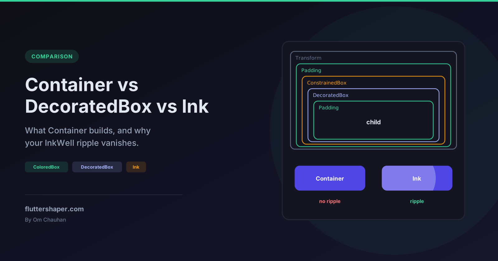
Container vs DecoratedBox vs Ink in Flutter (and Why Your InkWell Ripple Is Invisible)
Container doesn't paint or lay out anything itself. It's a StatelessWidget whose build method wraps your child in other widgets (eight of them if you set every argument), depending on which arguments you pass. Once you know which widgets and in what order, a few things that look like quirks stop being surprising: why width includes padding, why an empty Container fills the screen, and why an InkWell ripple disappears the moment you give its parent a colour.

Quick answer
| You want | Use |
|---|---|
| A solid background colour | ColoredBox |
| A gradient, border, rounded corners, shadow or image | DecoratedBox |
| A fixed size, or an empty gap | SizedBox |
| Space around a child | Padding |
| Several of the above at once | Container |
A background that InkWell ripples appear on top of |
Ink, or a Material with that colour |
What Container actually builds
This is the order from Container.build in the Flutter source. Each wrapper is added only if you pass its argument, from the child outwards:
Transform                      transform
└─ Padding                     margin
   └─ ConstrainedBox           width, height, constraints
      └─ DecoratedBox          foregroundDecoration (position: foreground)
         └─ DecoratedBox       decoration
            └─ ClipPath        clipBehavior (clips to the decoration's shape)
               └─ ColoredBox   color (only allowed without a decoration)
                  └─ Padding   padding (plus the decoration's own padding)
                     └─ Align  alignment
                        └─ child
A widget test pumps a Container with every argument set and walks the element tree below it:
Container(
  transform: Matrix4.rotationZ(0.05),
  margin: const EdgeInsets.all(8),
  width: 200,
  height: 120,
  foregroundDecoration: BoxDecoration(border: Border.all(color: Colors.white54)),
  decoration: BoxDecoration(
    color: Colors.indigo,
    borderRadius: BorderRadius.circular(16),
  ),
  clipBehavior: Clip.antiAlias,
  padding: const EdgeInsets.all(16),
  alignment: Alignment.center,
  child: const Text('Hello'),
)
It finds exactly Transform → Padding → ConstrainedBox → DecoratedBox → DecoratedBox → ClipPath → Padding → Align → Text. With only color and padding, the same walk finds ColoredBox → Padding → Text.
What the order explains
Padding is inside the background, margin is outside. The ColoredBox or DecoratedBox wraps the inner Padding, so the colour fills the padding. The margin Padding wraps the decoration, so the margin stays transparent.
width and height include the padding but not the margin. The ConstrainedBox sits outside the inner padding and inside the margin. A widget test with width: 100, padding: 20 and margin: 10 gives a widget that takes 120 × 120 on screen and a child that gets 60 × 60.
Taps on the margin never count. A Padding only passes hit tests through to its child, so a GestureDetector around the Container doesn't fire for a tap in the margin. A tap on the inner padding fires only if the Container has a color or decoration painting there. A widget test confirms all three cases. If you want the whole area tappable, give the GestureDetector behavior: HitTestBehavior.opaque.
clipBehavior clips the child, not the decoration. The ClipPath sits inside the DecoratedBox, so a boxShadow on the decoration survives the clip. This is why Container(clipBehavior: ...) is one of the fixes in ClipPath removes your shadow.
A Container with only a child is just the child. None of the wrappers are added, so build returns your child directly. The avoid_unnecessary_containers lint in flutter_lints flags this.
An empty Container expands. With no child and no fixed size, Container builds a LimitedBox(maxWidth: 0, maxHeight: 0) around a ConstrainedBox(constraints: BoxConstraints.expand()). It fills any space that is bounded and collapses to zero where it isn't. In a widget test, Center(child: Container(color: Colors.red)) fills the whole 800 × 600 test window, and the same Container inside a Row has a width of 0.
alignment makes it expand too. Align grows to fill bounded constraints so it has room to position the child. Center(child: Container(alignment: Alignment.center, child: SizedBox(width: 20, height: 20))) is 800 × 600 in the same test, while without alignment it is 20 × 20.
When a smaller widget is enough
const gap = SizedBox(height: 16); // instead of Container(height: 16)
const Column(
  children: [
    ColoredBox(
      color: Colors.amber, // instead of Container(color: ...)
      child: Padding(
        padding: EdgeInsets.all(12), // instead of Container(padding: ...)
        child: Text('Sale'),
      ),
    ),
    gap,
    DecoratedBox(
      // instead of Container(decoration: ...)
      decoration: BoxDecoration(
        color: Colors.white,
        borderRadius: BorderRadius.all(Radius.circular(12)),
        boxShadow: [BoxShadow(color: Color(0x22000000), blurRadius: 8)],
      ),
      child: Padding(padding: EdgeInsets.all(16), child: Text('Card')),
    ),
  ],
)
To be clear about what this changes: Container(color: ...) already is a ColoredBox once built, so the render objects, layout and painting are identical. The differences are elsewhere:
Containercan't beconst. Its constructor computesconstraintsfromwidthandheightin the initializer list, so it has noconstconstructor. Aconstwidget is the same instance on every build, and when a parent rebuilds, Flutter skips rebuilding a child whose widget is identical to last time. A widget test that rebuilds a parent five times shows aconstchild built once and a non-constchild built six times.- One fewer element per widget, because the
Containeritself no longer sits in the tree. - Clearer intent.
SizedBox(height: 16)says "gap";Container(height: 16)could be the start of anything.
flutter_lints already flags the two most common cases: sized_box_for_whitespace (a Container with only a size) and avoid_unnecessary_containers (a Container with only a child).
Keep using Container when you need several of its features together. Nesting Padding, DecoratedBox and ConstrainedBox by hand to get the same result is harder to read and builds the same tree.
Why your InkWell ripple is invisible
const buttonLabel = SizedBox(
  width: 160,
  height: 56,
  child: Center(child: Text('Tap me', style: TextStyle(color: Colors.white))),
);
// No visible ripple: the ColoredBox paints over the splash.
Container(
  color: Colors.indigo,
  child: InkWell(
    onTap: () {},
    child: buttonLabel,
  ),
)
InkWell doesn't paint its splash or highlight. It finds the nearest Material ancestor and adds the splash to that Material's list of ink features. When the Material paints, it draws all its ink features first and then paints its child on top. Your Container is part of that child, so its ColoredBox covers the splash completely.
Moving the InkWell outside (InkWell(child: Container(color: ...))) doesn't help, because the splash still goes to the same Material underneath the colour. A widget test that compares screenshots before and during a press finds zero changed pixels in both arrangements.
Fix 1: Ink
Ink takes a color or decoration like Container, but instead of painting it as part of the child, it registers it with the Material as an ink feature, the same way InkWell registers splashes. The colour is painted on the Material, and the splash is painted over it:
// Ripple visible: Ink paints the colour on the Material, under the splash.
Ink(
  color: Colors.indigo,
  child: InkWell(
    onTap: () {},
    child: buttonLabel,
  ),
)
For rounded corners, give InkWell the same borderRadius as the decoration:
Ink(
  decoration: BoxDecoration(
    color: Colors.indigo,
    borderRadius: BorderRadius.circular(16),
  ),
  child: InkWell(
    borderRadius: BorderRadius.circular(16), // keeps the splash inside the corners
    onTap: () {},
    child: buttonLabel,
  ),
)
Without it, the splash fills the rectangle: a widget test shows the pixel just outside the rounded corner turning grey during a press, and staying white once borderRadius is set.
Images work the same way with Ink.image:
Ink.image(
  image: image,
  fit: BoxFit.cover,
  width: 160,
  height: 100,
  child: InkWell(onTap: () {}),
)
Fix 2: give the InkWell its own Material
// Ripple visible: the InkWell gets its own coloured Material.
Material(
  color: Colors.indigo,
  borderRadius: BorderRadius.circular(16),
  clipBehavior: Clip.antiAlias, // clips the splash to the rounded shape
  child: InkWell(
    onTap: () {},
    child: buttonLabel,
  ),
)
Now the nearest Material is the coloured surface, so the splash lands on top of the colour. Without clipBehavior, a widget test shows the splash spilling into the rounded corners, the same as Ink without a borderRadius on the InkWell. This is how Flutter's own ElevatedButton, FilledButton and friends are built (a Material with the background colour, and an InkWell inside it), and it avoids the Ink caveats below. It's usually the simpler choice when the background is a plain colour or shape. Ink is handy when the decoration is a gradient or an image, or when you don't want to introduce another Material.
Ink gotchas
- It needs a
Materialancestor. Without one it throws "No Material widget found". AScaffoldprovides one. - Anything opaque between that
Materialand theInkhides the Ink itself, not just the ripple. A common case is aContainer(color: ...)used as a page background inside aScaffold: theInkpaints on theScaffold'sMaterialunderneath it. In a widget test with aColoredBoxplaced between theMaterialand twoInkbuttons, the buttons' colour disappears completely. Wrap the content in its ownMaterialinstead of a colouredContainer. - The
Materialdoesn't track movement on its own. TheInkdocumentation notes that if anInkwidget moves relative to itsMaterial, aLayoutChangedNotificationhas to be dispatched every frame it moves. Scrolling widgets do this automatically; animated transitions such asSlideTransitiondon't, so the decoration can end up out of step with its child. - Overlapping
Inkwidgets on the sameMaterialare painted in the order they were added, which the docs warn can look random in dynamic layouts.
Summary
Containeris shorthand for a fixed stack ofPadding,ConstrainedBox,DecoratedBox,ColoredBox,Align,ClipPathandTransform. Read its arguments as that stack and the layout behaviour follows.- When you only need one of those, use it directly. You get
const, and a tree that says what it does. - An
InkWellripple is painted on the nearestMaterial, below everything thatMaterialcontains. Put the colour on aMaterial(or useInk, which paints on one) and the ripple appears.
Related articles
Explore Our Projects
Beyond the shape tools — two more things we build and use every day. Free to try, no signup.
Keyboard Arena
Typing practice that plays like a game
Real-time WPM tests, mechanical switch audio, A-Z finger drills and 40+ structured lessons. Race a ghost of your best run instead of grinding random words.
- ✓ Live WPM & Accuracy
- ✓ Mechanical Switch Audio
- ✓ 40+ Guided Lessons
Flutter Log Explorer
Finally, Flutter logs you can read
Zero-config, real-time log capture from the Debug Adapter and Dart VM Service, with smart classification, filters and deduplication — all inside VS Code.
- ✓ Zero-Config Capture
- ✓ Smart Filters & Search
- ✓ Noise-Free Deduplication
Ready to Design Your Own Shapes?
Open the editor and start creating professional Flutter CustomPainter code visually.
Open the Editor