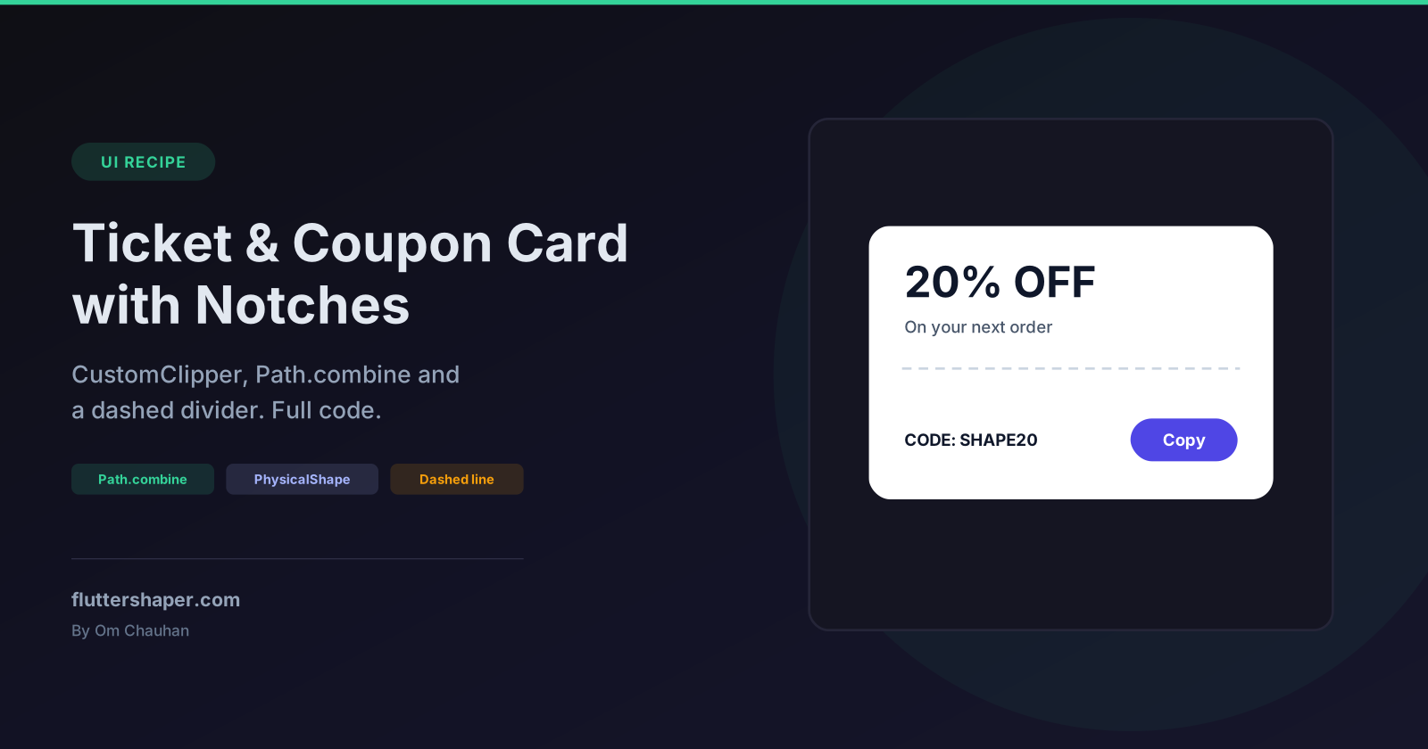
Build a Ticket / Coupon Card with Notches in Flutter
Event tickets, boarding passes, discount coupons and loyalty cards share one recognisable shape: a rounded card with a half-circle bitten out of each side and a dashed tear line between the two halves. Flutter has no built-in widget for it, but you can build it in about 100 lines with no packages.
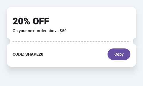
By the end you'll have:
- a
TicketClipperthat cuts the notches, - a
DashedLinePainterfor the tear line (Flutter has no dashed stroke built in), - a reusable
TicketCardwidget with a shadow that follows the notches.
Step 1: the shape with Path.combine
You could trace the outline point by point with arcToPoint around each notch. It's much simpler to describe the shape the way you'd explain it out loud: a rounded rectangle minus two circles. Path.combine with PathOperation.difference does exactly that.
import 'dart:math' as math;

import 'package:flutter/material.dart';

class TicketClipper extends CustomClipper<Path> {
  const TicketClipper({
    required this.notchY,
    this.notchRadius = 12,
    this.cornerRadius = 16,
  });

  /// Distance from the top of the card to the centre of the notches.
  final double notchY;
  final double notchRadius;
  final double cornerRadius;

  @override
  Path getClip(Size size) {
    final card = Path()
      ..addRRect(RRect.fromRectAndRadius(Offset.zero & size, Radius.circular(cornerRadius)));
    final notches = Path()
      ..addOval(Rect.fromCircle(center: Offset(0, notchY), radius: notchRadius))
      ..addOval(Rect.fromCircle(center: Offset(size.width, notchY), radius: notchRadius));
    return Path.combine(PathOperation.difference, card, notches);
  }

  @override
  bool shouldReclip(TicketClipper oldClipper) =>
      oldClipper.notchY != notchY ||
      oldClipper.notchRadius != notchRadius ||
      oldClipper.cornerRadius != cornerRadius;
}
Each circle is centred exactly on the card's left or right edge, so half of it falls outside the card and the other half bites in.
notchY is a distance in pixels, not a fraction of the height. That's deliberate: the notches have to line up with the divider, and the divider sits at a fixed distance below the top section. If the notch position were a percentage, it would drift away from the divider whenever the bottom section's height changed.
shouldReclip compares every field so the path is only rebuilt when something actually changes.
Step 2: a dashed divider
Flutter's Paint has no dash pattern, so draw short line segments in a loop:
class DashedLinePainter extends CustomPainter {
  const DashedLinePainter({required this.color, this.dash = 6, this.gap = 4});
  final Color color;
  final double dash;
  final double gap;

  @override
  void paint(Canvas canvas, Size size) {
    final paint = Paint()
      ..color = color
      ..strokeWidth = size.height;
    final y = size.height / 2;
    for (double x = 0; x < size.width; x += dash + gap) {
      canvas.drawLine(Offset(x, y), Offset(math.min(x + dash, size.width), y), paint);
    }
  }

  @override
  bool shouldRepaint(DashedLinePainter oldDelegate) =>
      oldDelegate.color != color || oldDelegate.dash != dash || oldDelegate.gap != gap;
}
The stroke width comes from the widget's height, so a SizedBox(height: 1) gives you a 1-pixel line and height: 2 a thicker one. math.min stops the last dash from running past the end.
Step 3: put it together
class TicketCard extends StatelessWidget {
  const TicketCard({
    super.key,
    required this.top,
    required this.bottom,
    this.topHeight = 120,
    this.notchRadius = 12,
  });

  final Widget top;
  final Widget bottom;
  final double topHeight;
  final double notchRadius;

  @override
  Widget build(BuildContext context) {
    return PhysicalShape(
      clipper: TicketClipper(notchY: topHeight, notchRadius: notchRadius),
      color: Colors.white,
      elevation: 6,
      shadowColor: Colors.black54,
      clipBehavior: Clip.antiAlias,
      child: Column(
        mainAxisSize: MainAxisSize.min,
        crossAxisAlignment: CrossAxisAlignment.stretch,
        children: [
          SizedBox(height: topHeight, child: top),
          Padding(
            padding: EdgeInsets.symmetric(horizontal: notchRadius + 8),
            child: SizedBox(
              height: 1,
              width: double.infinity,
              child: CustomPaint(painter: DashedLinePainter(color: Colors.grey.shade400)),
            ),
          ),
          bottom,
        ],
      ),
    );
  }
}
Three details make this work:
PhysicalShapeinstead ofClipPath. A plainClipPathwould cut off the shadow along with everything else outside the shape.PhysicalShapepaints an elevation shadow from the same clipper, so the shadow curves into the notches too. Why ClipPath removes shadows covers this and two other fixes.- The same
topHeightpositions both the notches and the divider, so they always line up. CrossAxisAlignment.stretch. Without it, the column centres its children horizontally and the top section shrinks to the width of its text, so your left-aligned heading drifts to the middle of the card. This is easy to miss when the test text happens to be wide.
The divider is padded by notchRadius + 8 on each side so the dashes stop short of the notches instead of running into them.
Using it
TicketCard(
  top: const Padding(
    padding: EdgeInsets.all(20),
    child: Column(
      crossAxisAlignment: CrossAxisAlignment.start,
      mainAxisAlignment: MainAxisAlignment.center,
      children: [
        Text('20% OFF', style: TextStyle(fontSize: 32, fontWeight: FontWeight.w800)),
        Text('On your next order above \$50'),
      ],
    ),
  ),
  bottom: Padding(
    padding: const EdgeInsets.all(20),
    child: Row(
      children: [
        const Expanded(
          child: Text('CODE: SHAPE20', style: TextStyle(fontWeight: FontWeight.w600)),
        ),
        FilledButton(onPressed: () {}, child: const Text('Copy')),
      ],
    ),
  ),
)
Because the notches are real holes in the shape, whatever is behind the card (a gradient, an image, a dark background) shows through them. There's no need to paint fake circles in the background colour, which breaks the moment the background changes.
Variations
Vertical tear line (boarding-pass stub)
Put the notches on the top and bottom edges instead, at a horizontal position notchX:
final notches = Path()
  ..addOval(Rect.fromCircle(center: Offset(notchX, 0), radius: notchRadius))
  ..addOval(Rect.fromCircle(center: Offset(notchX, size.height), radius: notchRadius));
Lay the card out with a Row instead of a Column, and use a vertical dashed line (swap x and y in the painter).
Scalloped edge
For a raffle-ticket or receipt look, cut a row of small circles along the bottom edge:
class ScallopClipper extends CustomClipper<Path> {
  const ScallopClipper({this.radius = 6});
  final double radius;

  @override
  Path getClip(Size size) {
    final card = Path()..addRect(Offset.zero & size);
    final bites = Path();
    for (double x = radius * 2; x < size.width - radius; x += radius * 3) {
      bites.addOval(Rect.fromCircle(center: Offset(x, size.height), radius: radius));
    }
    return Path.combine(PathOperation.difference, card, bites);
  }

  @override
  bool shouldReclip(ScallopClipper oldClipper) => oldClipper.radius != radius;
}
Outlined ticket
If you want a border instead of (or as well as) a shadow, stroke the clipper's path. Paint the stroke outside the clip, or the clip cuts the outer half of the stroke away:
class TicketBorderPainter extends CustomPainter {
  TicketBorderPainter(this.clipper);
  final TicketClipper clipper;

  @override
  void paint(Canvas canvas, Size size) {
    canvas.drawPath(
      clipper.getClip(size),
      Paint()
        ..style = PaintingStyle.stroke
        ..strokeWidth = 1.5
        ..color = Colors.indigo,
    );
  }

  @override
  bool shouldRepaint(TicketBorderPainter oldDelegate) => clipper.shouldReclip(oldDelegate.clipper);
}

Widget outlinedTicket(Widget child) {
  const clipper = TicketClipper(notchY: 120);
  return CustomPaint(
    foregroundPainter: TicketBorderPainter(clipper),
    child: ClipPath(clipper: clipper, child: child),
  );
}
foregroundPainter draws on top of the child, so the outline sits cleanly over the card's edge.
Prefer to draw it?
If your design calls for an unusual notch, a zig-zag edge or a shape that's tedious to describe with circles, you can draw it in Flutter Shape Builder. Boolean subtract does the same job as Path.combine. The editor exports CustomPainter code; to use the outline with PhysicalShape above, move the Path it builds into a clipper's getClip and scale it to the card's size with Path.transform.
Related articles
Explore Our Projects
Beyond the shape tools — two more things we build and use every day. Free to try, no signup.
Keyboard Arena
Typing practice that plays like a game
Real-time WPM tests, mechanical switch audio, A-Z finger drills and 40+ structured lessons. Race a ghost of your best run instead of grinding random words.
- ✓ Live WPM & Accuracy
- ✓ Mechanical Switch Audio
- ✓ 40+ Guided Lessons
Flutter Log Explorer
Finally, Flutter logs you can read
Zero-config, real-time log capture from the Debug Adapter and Dart VM Service, with smart classification, filters and deduplication — all inside VS Code.
- ✓ Zero-Config Capture
- ✓ Smart Filters & Search
- ✓ Noise-Free Deduplication
Ready to Design Your Own Shapes?
Open the editor and start creating professional Flutter CustomPainter code visually.
Open the Editor