Build a Gradient Progress Ring in Flutter with CustomPainter and SweepGradient
CircularProgressIndicator paints its arc in a single colour. For a gradient ring you draw it yourself: a grey track circle and a gradient arc on top. It's one small painter, but there are three colour bugs to avoid on the way:
SweepGradientstarts at 3 o'clock, but a progress ring starts at 12.- A round cap at the start of the arc picks up the gradient's end colour.
- At 100%, the two ends of the gradient meet in a hard seam.
This article builds the ring step by step, then animates it and makes it readable by screen readers.
The geometry
Three facts about Flutter's canvas drive the whole painter:
- Angles are in radians, starting at 3 o'clock and increasing clockwise, because the y axis points down. 12 o'clock is
-π / 2. - A stroke is centred on its path. To keep a 16 px stroke inside the widget, the circle's radius is half the shortest side minus half the stroke width.
Canvas.drawArc(rect, startAngle, sweepAngle, useCenter, paint)draws part of the oval that fitsrect. WithuseCenter: falseand a stroke paint, you get an open arc.
Step 1: the naive version
const ringColors = [Color(0xFF22D3EE), Color(0xFF6366F1), Color(0xFFEC4899)];

// Step 1: the naive version.
class NaiveRingPainter extends CustomPainter {
  NaiveRingPainter({required this.progress});
  final double progress; // 0.0 to 1.0

  @override
  void paint(Canvas canvas, Size size) {
    const strokeWidth = 16.0;
    final center = size.center(Offset.zero);
    final radius = (size.shortestSide - strokeWidth) / 2;
    final rect = Rect.fromCircle(center: center, radius: radius);

    final paint = Paint()
      ..style = PaintingStyle.stroke
      ..strokeWidth = strokeWidth
      ..strokeCap = StrokeCap.round
      ..shader = const SweepGradient(colors: ringColors).createShader(rect);

    canvas.drawArc(rect, -math.pi / 2, 2 * math.pi * progress, false, paint);
  }

  @override
  bool shouldRepaint(NaiveRingPainter oldDelegate) => oldDelegate.progress != progress;
}
(math is import 'dart:math' as math;.)
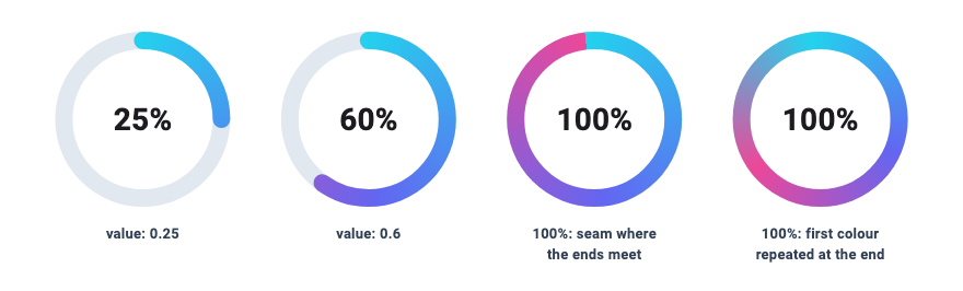
The arc starts at 12 o'clock, but the gradient doesn't care where the arc starts: a SweepGradient maps colours to angles around its centre, beginning at angle 0, which is 3 o'clock. Any progress past 25% crosses 3 o'clock, where the gradient jumps from its last colour back to its first. That's the hard pink-to-cyan edge in the first ring below.
Step 2: rotate the gradient to 12 o'clock
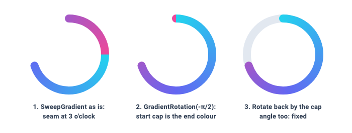
Every Gradient accepts a transform. GradientRotation(radians) rotates the gradient around the centre of the rect you pass to createShader, which here is also the centre of the ring. Adding transform: const GradientRotation(-math.pi / 2) to the SweepGradient lines its start up with the arc's start.
The seam at 3 o'clock is gone, but look closely at 12 o'clock in the second ring: the start of the arc has a pink tip.
That's the round cap. StrokeCap.round adds a half circle of radius strokeWidth / 2 beyond each end of the arc. The cap at the start sticks out counter-clockwise past 12 o'clock, into the angles just before the gradient's start, which is where the gradient holds its last colour.
Step 3: start the gradient behind the cap
The fix is to rotate the gradient a little further, so it begins where the cap begins. The cap is a circle of radius strokeWidth / 2 centred on the arc's end point, at distance radius from the centre, so it reaches asin(strokeWidth / 2 / radius) radians past the end of the arc.
Here is the complete painter, with a track, the cap fix, and an Animation<double> for progress so it can be animated later:
class GradientRingPainter extends CustomPainter {
  GradientRingPainter({
    required this.progress,
    required this.colors,
    this.strokeWidth = 16,
    this.trackColor = const Color(0xFFE2E8F0),
  }) : super(repaint: progress);

  final Animation<double> progress;
  final List<Color> colors;
  final double strokeWidth;
  final Color trackColor;

  @override
  void paint(Canvas canvas, Size size) {
    final center = size.center(Offset.zero);
    final radius = (size.shortestSide - strokeWidth) / 2;
    final rect = Rect.fromCircle(center: center, radius: radius);

    final track = Paint()
      ..style = PaintingStyle.stroke
      ..strokeWidth = strokeWidth
      ..color = trackColor;
    canvas.drawCircle(center, radius, track);

    final value = progress.value.clamp(0.0, 1.0);
    if (value == 0) return; // nothing to draw but the track

    const start = -math.pi / 2; // 12 o'clock
    // How far a round cap reaches past the end of the arc, as an angle.
    final capAngle = math.asin(strokeWidth / 2 / radius);

    final arc = Paint()
      ..style = PaintingStyle.stroke
      ..strokeWidth = strokeWidth
      ..strokeCap = StrokeCap.round
      ..shader = SweepGradient(
        colors: colors,
        // Start the gradient just behind the start cap.
        transform: GradientRotation(start - capAngle),
      ).createShader(rect);

    canvas.drawArc(rect, start, 2 * math.pi * value, false, arc);
  }

  @override
  bool shouldRepaint(GradientRingPainter oldDelegate) =>
      oldDelegate.progress != progress ||
      oldDelegate.strokeWidth != strokeWidth ||
      oldDelegate.trackColor != trackColor ||
      !listEquals(oldDelegate.colors, colors);
}
listEquals comes from package:flutter/foundation.dart. For a static ring, pass const AlwaysStoppedAnimation(0.7) as progress.
The gradient covers the whole circle, so a ring at 70% shows roughly the first 70% of the colour range and never reaches the last colour. The colour at the tip then also tells you how far along the ring is.
Rotating the canvas instead. You can also leave the gradient unrotated and rotate the canvas: translate to the centre, canvas.rotate(-math.pi / 2 - capAngle), translate back, and draw the arc from capAngle. A widget test comparing the two renders found only 72 of 102,400 bytes different, by at most 6 out of 255, so the result is the same. Rotating the gradient has one advantage: the canvas stays upright for anything else you draw, such as labels or tick marks.
The seam at 100%
When the ring closes, the last colour of the gradient meets the first at the top, and you get the same hard edge as in step 1, just in a new place (third ring in the first screenshot). Just before 100%, the end cap also starts to overlap the start cap and takes its colour from both ends of the gradient.
If your ring can reach 100%, end the gradient with the colour it starts with:
GradientRing(
  value: 1.0,
  label: 'Upload',
  colors: [Color(0xFF22D3EE), Color(0xFF6366F1), Color(0xFFEC4899), Color(0xFF22D3EE)],
)
The last stretch of the ring now fades back to the first colour, so there is nothing to see where the ends meet (fourth ring). The trade-off is that the pink peak sits two thirds of the way round instead of at the end.
Animating it
Option 1: an AnimationController with repaint
// Animation option 1: an AnimationController drives the painter directly.
class LoadingRing extends StatefulWidget {
  const LoadingRing({super.key});

  @override
  State<LoadingRing> createState() => _LoadingRingState();
}

class _LoadingRingState extends State<LoadingRing> with SingleTickerProviderStateMixin {
  late final AnimationController _controller = AnimationController(
    vsync: this,
    duration: const Duration(seconds: 2),
  )..forward();

  late final Animation<double> _progress = CurvedAnimation(
    parent: _controller,
    curve: Curves.easeOutCubic,
  );

  @override
  void dispose() {
    _controller.dispose();
    super.dispose();
  }

  @override
  Widget build(BuildContext context) {
    return CustomPaint(
      size: const Size.square(160),
      painter: GradientRingPainter(progress: _progress, colors: ringColors),
    );
  }
}
GradientRingPainter passes its animation to super(repaint: progress). The CustomPaint listens to that Listenable and repaints whenever it ticks, without calling build again. In a widget test that pumps ten 100 ms frames of this animation, build runs once and paint runs 11 times.
Note the size on CustomPaint. Without a child or a size, a CustomPaint gets no space from a parent like Center, and the painter has nothing to draw on.
Option 2: TweenAnimationBuilder
When the value comes from your app state (an upload, steps completed, a score), you usually just want the ring to glide to each new value. TweenAnimationBuilder does that without a controller:
// Animation option 2: animate to whatever value the parent passes in.
class GradientRing extends StatelessWidget {
  const GradientRing({
    super.key,
    required this.value,
    required this.label,
    this.size = 160,
    this.colors = ringColors,
  });

  final double value; // 0.0 to 1.0
  final String label;
  final double size;
  final List<Color> colors;

  @override
  Widget build(BuildContext context) {
    final percent = '${(value * 100).round()}%';
    return Semantics(
      label: label,
      value: percent,
      child: TweenAnimationBuilder<double>(
        tween: Tween(begin: 0, end: value),
        duration: const Duration(milliseconds: 600),
        curve: Curves.easeOutCubic,
        builder: (context, animatedValue, child) => CustomPaint(
          painter: GradientRingPainter(
            progress: AlwaysStoppedAnimation(animatedValue),
            colors: colors,
          ),
          child: child,
        ),
        // Built once, not on every animation frame.
        child: SizedBox.square(
          dimension: size,
          child: Center(
            child: ExcludeSemantics(
              child: Text(
                percent,
                style: const TextStyle(fontSize: 28, fontWeight: FontWeight.w700),
              ),
            ),
          ),
        ),
      ),
    );
  }
}
How it behaves:
beginis only used the first time. The ring animates in from 0 when it first appears. After that,TweenAnimationBuilderignoresbegin: a widget test that changesvaluefrom 0.4 to 0.8 sees the animation start at 0.4, not 0.- The painter is reused.
AlwaysStoppedAnimationwraps each frame'sdoubleso the sameGradientRingPainterworks here. A new painter is created every frame, andshouldRepaintreturnstruebecause itsprogressobject is new. - The
childis built once. The centre text goes through thechildparameter, so it isn't rebuilt on every frame. It also gives theCustomPaintits size.
Use option 1 for looping or indeterminate animations, or when you already manage a controller. Use option 2 when a parent widget owns the value.
Semantics
A CustomPaint is invisible to screen readers: they get no text and no value from it. GradientRing wraps everything in Semantics with a label (what is progressing) and a value (how far). A widget test confirms the ring is announced with the label "Upload progress" and the value "40%", and "80%" after the value changes.
This is the same pattern CircularProgressIndicator uses. It wraps itself in Semantics(label: semanticsLabel, value: semanticsValue) and, when it has a value, defaults semanticsValue to '${(value * 100).round()}%'.
Two details in GradientRing are worth keeping:
- The percentage text inside the ring is wrapped in
ExcludeSemantics. Without it, a widget test shows the text merged into the label ("Upload progress" followed by "80%"), so the number is read twice: once in the label and once as the value. - The semantic value is the target, not the animated value. The
Semanticswidget sits outside theTweenAnimationBuilder, so assistive technology gets "80%" straight away instead of a stream of in-between numbers.
Pick the colours
The ring works with any number of colours. If you want to try out stops and colours before hard-coding them, the gradient builder previews gradients and outputs the Dart code.
Related articles
Explore Our Projects
Beyond the shape tools — two more things we build and use every day. Free to try, no signup.
Keyboard Arena
Typing practice that plays like a game
Real-time WPM tests, mechanical switch audio, A-Z finger drills and 40+ structured lessons. Race a ghost of your best run instead of grinding random words.
- ✓ Live WPM & Accuracy
- ✓ Mechanical Switch Audio
- ✓ 40+ Guided Lessons
Flutter Log Explorer
Finally, Flutter logs you can read
Zero-config, real-time log capture from the Debug Adapter and Dart VM Service, with smart classification, filters and deduplication — all inside VS Code.
- ✓ Zero-Config Capture
- ✓ Smart Filters & Search
- ✓ Noise-Free Deduplication
Ready to Design Your Own Shapes?
Open the editor and start creating professional Flutter CustomPainter code visually.
Open the Editor