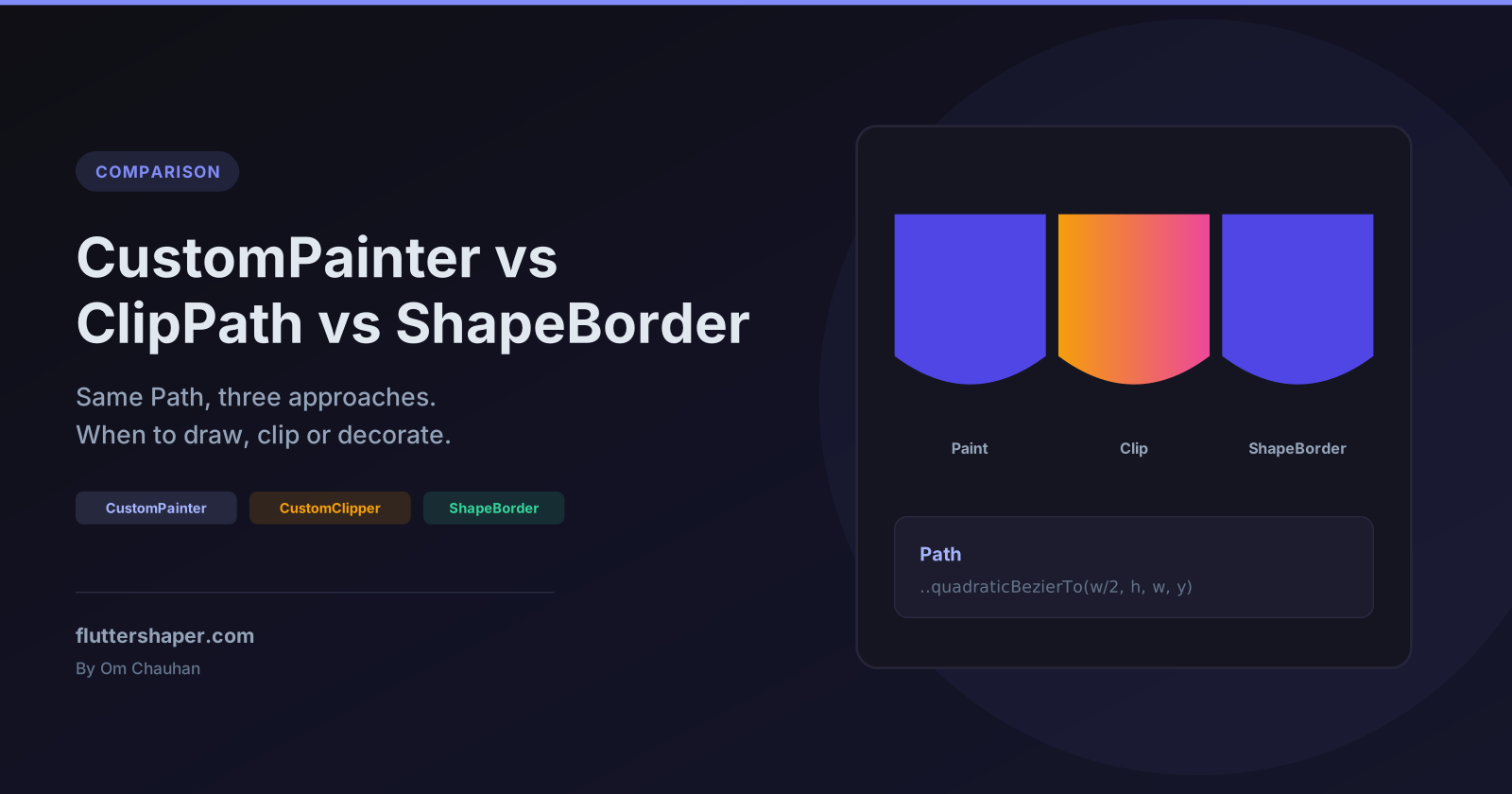
CustomPainter vs ClipPath vs ShapeBorder: Which One Should You Use in Flutter?
Every custom shape in Flutter ends up as a Path. What changes is what you do with that path:
- Draw it with a
CustomPainter. - Cut a child widget to it with
ClipPathand aCustomClipper. - Describe an outline with a
ShapeBorder, whichContainer,Material,CardandInkWellalready know how to fill, shadow and clip.
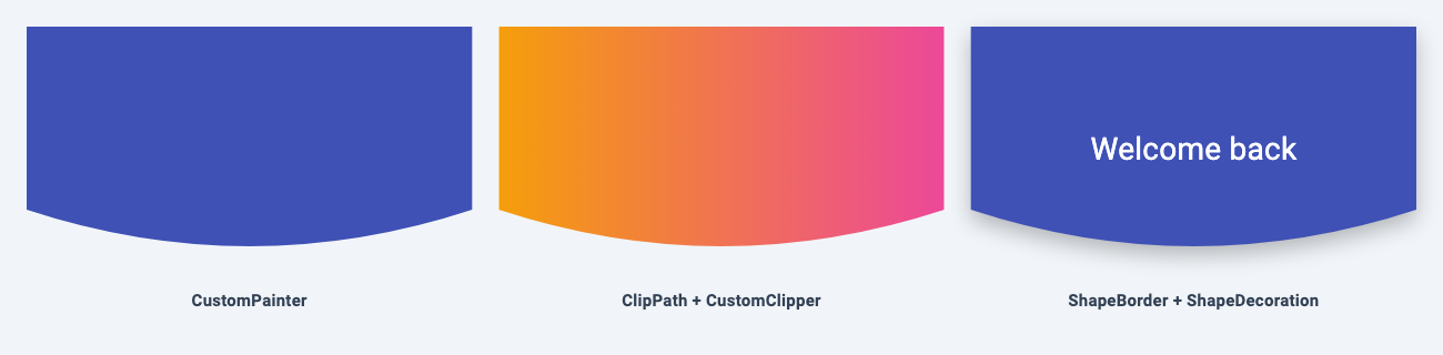
Most "why did my shadow disappear", "why can't I put an image in my shape" and "why do taps land outside my shape" questions come from picking the wrong one. This article builds the same curved header three ways so you can see exactly where each approach wins.
Quick answer
| CustomPainter | ClipPath + CustomClipper | ShapeBorder | |
|---|---|---|---|
| What it does | Draws pixels on a canvas | Masks a child widget | Describes an outline other widgets use |
| Image / video / any widget inside the shape | No (the child is painted on top, unclipped) | Yes | Yes (with clipBehavior) |
| Shadow that follows the shape | Manual (drawShadow or a blurred path) |
No, the clip cuts it off | Built in (ShapeDecoration.shadows, Material.elevation) |
| Taps outside the shape | Counted, unless you mask them (see below) | Ignored | Same as the widget using it |
| Strokes, multiple paths, text on the canvas | Best fit | No | Only a border stroke |
| Boilerplate | Low | Lowest | Highest (5 overrides) |
Rule of thumb: draw when the shape is the content, clip when the content is something else (a photo, a gradient widget, a video), and use a ShapeBorder when you want the shape to behave like a normal Material surface.
The shared path
All three examples below use this function, so the only thing that changes between them is how the path is used:
Path curvedHeaderPath(Size size) {
  final w = size.width;
  final h = size.height;
  return Path()
    ..moveTo(0, 0)
    ..lineTo(0, h * 0.75)
    ..quadraticBezierTo(w / 2, h * 1.05, w, h * 0.75)
    ..lineTo(w, 0)
    ..close();
}
The path is built from the Size it is given, never from fixed pixel values, so it scales with the widget. If quadratic and cubic curves are new to you, the Flutter Bezier curves guide covers quadraticBezierTo and cubicTo in detail.
Option 1: CustomPainter (draw it)
class HeaderPainter extends CustomPainter {
  HeaderPainter({required this.color});
  final Color color;

  @override
  void paint(Canvas canvas, Size size) {
    canvas.drawPath(curvedHeaderPath(size), Paint()..color = color);
  }

  @override
  bool shouldRepaint(HeaderPainter oldDelegate) => oldDelegate.color != color;
}

// Usage
SizedBox(
  height: 220,
  width: double.infinity,
  child: CustomPaint(painter: HeaderPainter(color: Colors.indigo)),
)
When it is the right choice
- The shape is the content: charts, gauges, progress rings, decorative backgrounds, signatures.
- You need several paths, strokes, text or gradients in one place. A painter can call
drawPath,drawCircle,drawParagraphand friends as many times as it likes. - You want the cheapest option. A single
drawPathwith a solid or gradientPaintcosts less than clipping a child.
Gradients don't need a clip either. Give the Paint a shader:
class GradientHeaderPainter extends CustomPainter {
  @override
  void paint(Canvas canvas, Size size) {
    final paint = Paint()
      ..shader = const LinearGradient(
        colors: [Color(0xFFF59E0B), Color(0xFFEC4899)],
      ).createShader(Offset.zero & size);
    canvas.drawPath(curvedHeaderPath(size), paint);
  }

  @override
  bool shouldRepaint(GradientHeaderPainter oldDelegate) => false;
}
Gotchas
A CustomPaint with no child is zero-sized by default. Its size argument defaults to Size.zero, so without a parent that forces a size (like the SizedBox above) your painter runs with nothing to paint on.
Taps land on the whole rectangle. A background painter treats every point in its box as a hit unless you say otherwise. In the curved header, tapping the empty corner below the curve still fires onTap. The reliable fix is to wrap the CustomPaint in a ClipPath with clipBehavior: Clip.none. ClipPath always hit-tests against its path, even when it isn't clipping anything, so it works as a tap mask without changing what's painted:
GestureDetector(
  onTap: onTap,
  child: ClipPath(
    clipper: HeaderClipper(),
    clipBehavior: Clip.none, // only used for hit testing, nothing is clipped
    child: SizedBox(
      height: 220,
      width: double.infinity,
      child: CustomPaint(painter: HeaderPainter(color: Colors.indigo)),
    ),
  ),
)
HeaderClipper is the clipper from option 2 below.
You can also override the painter's hitTest, but it doesn't receive the size. The common workaround of saving the size in paint() breaks after a rebuild: Flutter swaps in a new painter, and if shouldRepaint returns false, paint() never runs on it. The saved size stays zero and every tap misses. Make taps respect your custom shape covers hit testing in depth.
child is not clipped. CustomPaint(painter: ..., child: ...) paints your shape behind the child, and the child keeps its rectangular bounds. If you need the child cut to the shape, you want option 2 or 3.
Repaints. shouldRepaint doesn't stop every repaint. If your painter runs every frame, read why your CustomPainter repaints every frame.
Option 2: ClipPath + CustomClipper (cut a child to it)
class HeaderClipper extends CustomClipper<Path> {
  @override
  Path getClip(Size size) => curvedHeaderPath(size);

  @override
  bool shouldReclip(HeaderClipper oldClipper) => false;
}

// Usage
ClipPath(
  clipper: HeaderClipper(),
  child: Image.asset(
    'assets/mountains.jpg',
    height: 220,
    width: double.infinity,
    fit: BoxFit.cover,
  ),
)
When it is the right choice
- The content inside the shape is another widget: a photo, a
Containerwith a gradient, a video player, a map, a whole subtree. - You want taps outside the shape ignored.
ClipPathonly hit-tests inside its path, so the empty corner under the curve doesn't respond. That's usually what you want for custom-shaped buttons.
Gotchas
It clips the shadow too. Anything painted outside the path disappears, and shadows are always painted outside the shape. A BoxShadow on the child vanishes completely. This is the single most common complaint about ClipPath. Flutter ClipPath removes your shadow walks through three fixes.
Clipping has a cost. ClipPath defaults to Clip.antiAlias, which gives smooth edges. Clip.hardEdge is cheaper but leaves jagged diagonals and curves. Avoid Clip.antiAliasWithSaveLayer unless you actually see edge artifacts, because it allocates an offscreen buffer. And if all you're clipping is a solid colour or gradient, draw it with option 1 instead.
Animating the clip. Pass a Listenable to the clipper's reclip argument (super(reclip: animation)) and the clip updates every tick without rebuilding the widget, the same idea as repaint: on a painter.
Shortcut for existing borders. If you already have a ShapeBorder, ClipPath.shape(shape: StadiumBorder(), child: ...) clips to it without writing a clipper.
Option 3: ShapeBorder (let widgets decorate it)
A ShapeBorder is the most boilerplate of the three, but it plugs into widgets that already know how to paint shadows, ink ripples and elevation:
class CurvedHeaderBorder extends ShapeBorder {
  const CurvedHeaderBorder();

  @override
  EdgeInsetsGeometry get dimensions => EdgeInsets.zero;

  @override
  Path getOuterPath(Rect rect, {TextDirection? textDirection}) =>
      curvedHeaderPath(rect.size).shift(rect.topLeft);

  @override
  Path getInnerPath(Rect rect, {TextDirection? textDirection}) =>
      getOuterPath(rect, textDirection: textDirection);

  @override
  void paint(Canvas canvas, Rect rect, {TextDirection? textDirection}) {}

  @override
  ShapeBorder scale(double t) => this;
}
Note the .shift(rect.topLeft). A clipper always gets a size starting at (0, 0), but a ShapeBorder gets a Rect that can sit anywhere, so the path has to be moved into place.
Now the same shape works with a shadow and clipped content:
Container(
  height: 220,
  clipBehavior: Clip.antiAlias,
  decoration: const ShapeDecoration(
    shape: CurvedHeaderBorder(),
    color: Colors.indigo,
    shadows: [
      BoxShadow(color: Colors.black26, blurRadius: 16, offset: Offset(0, 8)),
    ],
  ),
  child: const Center(
    child: Text('Welcome back', style: TextStyle(color: Colors.white, fontSize: 28)),
  ),
)
This works because Container applies its clip to the child only, inside the decoration. The shadow is painted by the decoration, outside the clip, so it survives.
The same border also drops into Material widgets:
Material(
  color: Colors.indigo,
  shape: const CurvedHeaderBorder(),
  child: InkWell(
    customBorder: const CurvedHeaderBorder(),
    onTap: () {},
    child: const SizedBox(height: 220, width: double.infinity),
  ),
)
Material(shape:) gives you elevation shadows, and InkWell(customBorder:) keeps the ripple inside the curve instead of splashing across the rectangle. Card(shape:) accepts it too.
Gotchas
- Buttons need an
OutlinedBorder, not a plainShapeBorder.ButtonStyle.shapeis typed asOutlinedBorder, so extend that class (and implementcopyWith) if you want the shape on anElevatedButton. - Animation.
AnimatedContainerinterpolates decorations by callingShapeBorder.lerpFrom/lerpTo. If you don't override them, a custom border snaps from one shape to the other halfway through the animation instead of morphing. spreadRadiusworks.ShapeDecorationbuilds each shadow by callinggetOuterPathwith a rect inflated by the spread. Because your path is built fromrect.size, the shadow grows with the shape.
Which one should you choose?
Ask these in order:
- Is something other than a flat fill inside the shape (image, video, widgets)? If no, use a CustomPainter. It's the simplest and cheapest.
- Do you need a shadow, elevation or an ink ripple that follows the shape? If yes, use a ShapeBorder.
- Otherwise, use ClipPath + CustomClipper. It has the least code for "put this widget in that shape."
You can also mix them. A common pattern is a ShapeBorder for the surface and shadow, with a CustomPainter drawing decorations on top.
Skip the coordinate maths
Every approach above needs the same thing: a Path. If you'd rather draw the outline than work out control points by hand, Flutter Shape Builder lets you draw it visually and exports it as CustomPainter code, which is option 1 as-is. To reuse the outline in a clipper or ShapeBorder, copy the Path it builds and scale it from the design's size to the widget's size with Path.transform.
Related articles
Explore Our Projects
Beyond the shape tools — two more things we build and use every day. Free to try, no signup.
Keyboard Arena
Typing practice that plays like a game
Real-time WPM tests, mechanical switch audio, A-Z finger drills and 40+ structured lessons. Race a ghost of your best run instead of grinding random words.
- ✓ Live WPM & Accuracy
- ✓ Mechanical Switch Audio
- ✓ 40+ Guided Lessons
Flutter Log Explorer
Finally, Flutter logs you can read
Zero-config, real-time log capture from the Debug Adapter and Dart VM Service, with smart classification, filters and deduplication — all inside VS Code.
- ✓ Zero-Config Capture
- ✓ Smart Filters & Search
- ✓ Noise-Free Deduplication
Ready to Design Your Own Shapes?
Open the editor and start creating professional Flutter CustomPainter code visually.
Open the Editor