Neumorphism and Glassmorphism in Flutter: Build Both, and Know When Not To
Both styles are built from widgets you already know. Neumorphism is two BoxShadows on a surface the same colour as the screen. Glassmorphism is a BackdropFilter blur under a translucent fill. Each has one trap that catches most first attempts:
- Flutter's
BoxShadowhas noinsetoption, so the "pressed" half of neumorphism needs a painter.BlurStyle.innerlooks like the answer and isn't. BackdropFilterblurs everything inside its nearest ancestor clip, which without aClipRRectusually means the whole screen.
Both styles also trade contrast for looks, so the last section covers where they cause accessibility problems and when to skip them.
Neumorphism
The raised surface: two shadows
const neuBackground = Color(0xFFE0E5EC);
const neuLight = Colors.white;
const neuDark = Color(0xFFA3B1C6);

BoxDecoration neuRaised({double radius = 24, double distance = 8, double blur = 16}) {
  return BoxDecoration(
    color: neuBackground, // same colour as the screen behind it
    borderRadius: BorderRadius.circular(radius),
    boxShadow: [
      BoxShadow(color: neuLight, offset: Offset(-distance, -distance), blurRadius: blur),
      BoxShadow(color: neuDark, offset: Offset(distance, distance), blurRadius: blur),
    ],
  );
}
Container(
  width: 140,
  height: 140,
  decoration: neuRaised(),
)
Three rules make it work:
- The surface and the background are the same colour. The element has no outline of its own. Its edges exist only where the two shadows are.
- The light shadow points towards the light source (top left here) and the dark one away from it, with equal and opposite offsets.
- Both shadows use the same blur and distance, so the surface looks evenly lit from one direction.
The pressed state: BoxShadow has no inset
CSS writes a pressed neumorphic button as box-shadow: inset .... Flutter's BoxShadow has no such flag. It has a blurStyle, and BlurStyle.inner, documented in dart:ui as "fuzzy inside, nothing outside", looks like it should do the job:
Container(
  width: 140,
  height: 140,
  decoration: BoxDecoration(
    color: neuBackground,
    borderRadius: BorderRadius.circular(24),
    boxShadow: const [
      BoxShadow(color: neuDark, offset: Offset(6, 6), blurRadius: 12, blurStyle: BlurStyle.inner),
      BoxShadow(color: neuLight, offset: Offset(-6, -6), blurRadius: 12, blurStyle: BlurStyle.inner),
    ],
  ),
)
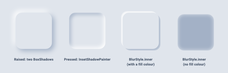
It doesn't, for two reasons you can see in the third and fourth tiles of the screenshot:
- "Inner" refers to the shadow's own shape, not your box. The blur is kept inside the shadow's (offset) rectangle: solid in the middle, a little lighter just inside its edge, and nothing at all outside it, so the rim is hard. That is not a shadow cast into the box.
- Shadows are painted under the fill.
BoxDecorationpaints every shadow first and the colour on top. With an opaquecolor, everything inside the box is hidden, and all that's left is the hard-edged sliver of each offset shadow sticking out at the sides (third tile). Remove the colour and you see what the inner blur really paints: a blob that is darkest in the middle (fourth tile), the opposite of an inset shadow.
A real inset shadow with CustomPainter
An inset shadow is the shadow of a hole. Build a path that is a large rectangle with your rounded box cut out of it, blur it, shift it by the offset, and clip to the box. The part of the blurred frame that spills inside the box is the inset shadow:
class InsetShadowPainter extends CustomPainter {
  const InsetShadowPainter({required this.radius, required this.shadows});
  final double radius;
  final List<BoxShadow> shadows;

  @override
  void paint(Canvas canvas, Size size) {
    final box = RRect.fromRectAndRadius(Offset.zero & size, Radius.circular(radius));
    canvas.save();
    canvas.clipRRect(box);
    for (final shadow in shadows) {
      final reach = shadow.blurSigma * 3 + shadow.offset.distance;
      // A frame around the box: a big rectangle with the box cut out of it.
      final frame = Path()
        ..fillType = PathFillType.evenOdd
        ..addRect(box.outerRect.inflate(reach))
        ..addRRect(box.deflate(shadow.spreadRadius));
      // Shift the frame and blur it; only the part that falls inside the box shows.
      canvas.drawPath(frame.shift(shadow.offset), shadow.toPaint());
    }
    canvas.restore();
  }

  @override
  bool shouldRepaint(InsetShadowPainter oldDelegate) =>
      oldDelegate.radius != radius || !listEquals(oldDelegate.shadows, shadows);
}

const neuInsetShadows = [
  BoxShadow(color: neuDark, offset: Offset(6, 6), blurRadius: 12),
  BoxShadow(color: neuLight, offset: Offset(-6, -6), blurRadius: 12),
];
A few details:
PathFillType.evenOddturns the inner rounded rectangle into a hole, so only the frame is filled.reachmakes the frame wide enough that its outer edge never shows inside the box.blurSigma × 3is roughly where a Gaussian blur fades out.shadow.toPaint()gives the same Gaussian blur aBoxDecorationwould use for thatblurRadius, so the values match your raised shadows.- A positive offset puts the dark shading along the top and left inner edges, and the negative-offset white shadow lights the bottom and right, matching a light source at the top left.
listEqualscomes frompackage:flutter/foundation.dart.
The painter has to draw above the fill, so use it as a CustomPaint inside the decorated box rather than as a decoration:
DecoratedBox(
  decoration: BoxDecoration(
    color: neuBackground,
    borderRadius: BorderRadius.circular(24),
  ),
  child: const CustomPaint(
    painter: InsetShadowPainter(radius: 24, shadows: neuInsetShadows),
    child: SizedBox(width: 140, height: 140),
  ),
)
A button that switches between the two
class NeuButton extends StatefulWidget {
  const NeuButton({
    super.key,
    required this.onPressed,
    required this.child,
    this.radius = 24,
  });

  final VoidCallback onPressed;
  final Widget child;
  final double radius;

  @override
  State<NeuButton> createState() => _NeuButtonState();
}

class _NeuButtonState extends State<NeuButton> {
  bool _pressed = false;

  void _setPressed(bool value) => setState(() => _pressed = value);

  @override
  Widget build(BuildContext context) {
    return Semantics(
      button: true,
      child: GestureDetector(
        onTapDown: (_) => _setPressed(true),
        onTapUp: (_) => _setPressed(false),
        onTapCancel: () => _setPressed(false),
        onTap: widget.onPressed,
        child: DecoratedBox(
          decoration: _pressed
              ? BoxDecoration(
                  color: neuBackground,
                  borderRadius: BorderRadius.circular(widget.radius),
                )
              : neuRaised(radius: widget.radius),
          child: CustomPaint(
            painter: _pressed
                ? InsetShadowPainter(radius: widget.radius, shadows: neuInsetShadows)
                : null,
            child: Padding(
              padding: const EdgeInsets.symmetric(horizontal: 32, vertical: 20),
              child: widget.child,
            ),
          ),
        ),
      ),
    );
  }
}
GestureDetector alone doesn't tell screen readers that this is a button, so the Semantics(button: true) wrapper matters. A widget test confirms the node is reported as a button with a tap action and the child's text as its label, and that pressing swaps in the inset painter. It is not keyboard-focusable, though. If your app runs on desktop or web, or needs keyboard and switch access, build the look on top of a real button (for example an InkWell, which handles focus) instead of a bare GestureDetector.
Glassmorphism
The glass card
class GlassCard extends StatelessWidget {
  const GlassCard({
    super.key,
    required this.child,
    this.radius = 24,
    this.blurSigma = 16,
  });

  final Widget child;
  final double radius;
  final double blurSigma;

  @override
  Widget build(BuildContext context) {
    final borderRadius = BorderRadius.circular(radius);

    // The user asked the OS for more contrast: drop the see-through effect.
    if (MediaQuery.highContrastOf(context)) {
      return DecoratedBox(
        decoration: BoxDecoration(color: Colors.white, borderRadius: borderRadius),
        child: child,
      );
    }

    return ClipRRect(
      borderRadius: borderRadius, // limits the blur to the card
      child: BackdropFilter(
        filter: ImageFilter.blur(sigmaX: blurSigma, sigmaY: blurSigma),
        child: DecoratedBox(
          decoration: BoxDecoration(
            color: Colors.white.withValues(alpha: 0.2),
            borderRadius: borderRadius,
            border: Border.all(color: Colors.white.withValues(alpha: 0.4)),
          ),
          child: child,
        ),
      ),
    );
  }
}
ImageFilter comes from dart:ui (import 'dart:ui' show ImageFilter;). Three layers do the work:
BackdropFiltertakes what has already been painted behind it, applies the filter, and then paints its child on top.- The translucent fill lightens the blurred backdrop so it reads as a surface.
- The thin, semi-transparent white border gives the glass an edge, since the fill alone often blends into the background.
Note that ImageFilter.blur takes a sigma directly, unlike BoxShadow.blurRadius, which Flutter converts with sigma = blurRadius × 0.57735 + 0.5. A blurSigma of 16 is a stronger blur than a blurRadius of 16.
Why the ClipRRect is required
The BackdropFilter documentation says the filter "will be applied to all the area within its parent or ancestor widget's clip. If there's no clip, the filter will be applied to the full screen." The child only decides what is painted on top, not how much gets blurred.
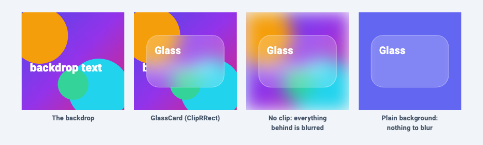
The third panel in the screenshot is the card without the ClipRRect. Each panel in that test sits inside its own ClipRect, so the blur stops at the panel's edge. In an app with no clip above it, it would cover the whole screen.
Use ClipRRect with the same radius as the decoration, not ClipRect. In a widget test, a ClipRect version changed 144 backdrop pixels in the card's four corners, outside the rounded border, while the ClipRRect version changed none.
Cost
The BackdropFilter documentation calls the effect "relatively expensive, especially if the filter is non-local, such as a blur". Two things it recommends:
- If you only want to blur a widget itself, not what's behind it, use
ImageFilteredinstead. It's simpler and cheaper. - For many glass items in a list, wrap the list in a
BackdropGroupand useBackdropFilter.grouped. Filters that share a backdrop key can be combined by the engine into one backdrop operation.
Accessibility, and when not to use these styles
Neumorphism
The whole style rests on low contrast. A button's outline is drawn only by shadows a few shades away from the background, and its pressed state differs from its raised state only by where those shadows are.
WCAG 2.1 success criterion 1.4.11 asks for a 3:1 contrast ratio for the visual information needed to identify a control and its state. Using the WCAG formula:
/// WCAG contrast ratio between two opaque colours (1.0 to 21.0).
double contrastRatio(Color a, Color b) {
  final la = a.computeLuminance();
  final lb = b.computeLuminance();
  final hi = la > lb ? la : lb;
  final lo = la > lb ? lb : la;
  return (hi + 0.05) / (lo + 0.05);
}
Pair on #E0E5EC |
Contrast |
|---|---|
Dark shadow #A3B1C6 (at full strength, before blurring) |
1.72 : 1 |
| White highlight | 1.27 : 1 |
Light grey text #9AA5B4, common in neumorphic mockups |
1.97 : 1 |
Slate text #4A5568 |
5.94 : 1 |
Even the darkest point of the shadow is well under 3:1, and the blur only lowers it. If you use the style:
- Make labels and icons carry the meaning, with at least 4.5:1 contrast for text.
- Show state with more than a shadow: change the icon or text colour, add an accent fill, or show a checkmark.
- Add a visible focus indicator for keyboard users.
- Avoid it for dense or critical UI such as forms, settings and anything where users need to find the controls at a glance. It suits a small number of large, clearly labelled controls.
Glassmorphism
- Text contrast depends on what's behind the card, and changes as content moves underneath it. Check the worst case (white text over the lightest part of the backdrop), and raise the fill opacity until it passes rather than tuning it on one screenshot.
- It needs a busy backdrop. On a plain colour there is nothing to blur, and the card is just a translucent box (last panel in the screenshot).
- Respect the platform's contrast setting.
GlassCardchecksMediaQuery.highContrastOf(context)and switches to an opaque card. Flutter documents this flag as iOS's Settings > Accessibility > Increase Contrast and only updates it on iOS, so on other platforms consider a setting in your own app. - Keep it to a few surfaces. A navigation bar or a dialog over a photo works well. A screen made entirely of glass cards over glass cards gets hard to read.
Related articles
- BoxShadow vs PhysicalModel vs Material Elevation: Why Your Flutter Shadow Looks Wrong
- Container vs DecoratedBox vs Ink in Flutter (and Why Your InkWell Ripple Is Invisible)
- Flutter ClipPath Removes Your Shadow: 3 Ways to Fix It
- Visual Shadow Generator: Create Soft, Layered Elevation Shadows in Flutter
Explore Our Projects
Beyond the shape tools — two more things we build and use every day. Free to try, no signup.
Keyboard Arena
Typing practice that plays like a game
Real-time WPM tests, mechanical switch audio, A-Z finger drills and 40+ structured lessons. Race a ghost of your best run instead of grinding random words.
- ✓ Live WPM & Accuracy
- ✓ Mechanical Switch Audio
- ✓ 40+ Guided Lessons
Flutter Log Explorer
Finally, Flutter logs you can read
Zero-config, real-time log capture from the Debug Adapter and Dart VM Service, with smart classification, filters and deduplication — all inside VS Code.
- ✓ Zero-Config Capture
- ✓ Smart Filters & Search
- ✓ Noise-Free Deduplication
Ready to Design Your Own Shapes?
Open the editor and start creating professional Flutter CustomPainter code visually.
Open the Editor