BoxShadow vs PhysicalModel vs Material Elevation: Why Your Flutter Shadow Looks Wrong
Flutter has two separate shadow systems, and they don't share any parameters.
BoxShadowdescribes a blurred copy of your shape.BoxDecorationandShapeDecorationpaint it behind the widget. You choose the colour, offset, blur and spread.- Elevation (
PhysicalModel,PhysicalShape, and everyMaterialorCard) hands a shape and a height to the engine, which draws the shadow itself. You choose the elevation and the colour, nothing else.
Most "my shadow looks wrong" problems come from expecting one system to behave like the other, or from something that has nothing to do with the shadow: a parent that clips it, a fill that shows it through, or a dark background that hides it.
Quick answer
| BoxShadow | PhysicalModel / PhysicalShape | Material elevation | |
|---|---|---|---|
| Used by | BoxDecoration, ShapeDecoration (so Container, DecoratedBox, Ink) |
Used directly | Material, Card, app bars, buttons, dialogs |
| You control | colour, offset, blurRadius, spreadRadius, blurStyle |
elevation, shadowColor |
elevation, shadowColor, plus surfaceTintColor in Material 3 |
| Several shadows | Yes, it's a list | No | No |
| How it's drawn | The shape, shifted and grown, filled with a Gaussian-blurred paint | Canvas.drawShadow(path, color, elevation, …) |
Builds a PhysicalModel or PhysicalShape, so the same as the middle column |
| Clips the child | No | Only if you set clipBehavior (default Clip.none) |
Only if you set clipBehavior (default Clip.none) |
| Animating it | AnimatedContainer interpolates the shadow list |
AnimatedPhysicalModel |
Material animates elevation changes itself (200 ms by default) |
Rule of thumb: if a design gives you offset, blur and spread values, or more than one shadow, use BoxShadow. If the widget is a Material surface and should behave like the rest of your theme, use elevation.
BoxShadow: a blurred copy of your shape
Container(
  width: 160,
  height: 120,
  decoration: BoxDecoration(
    color: Colors.white,
    borderRadius: BorderRadius.circular(16),
    boxShadow: const [
      BoxShadow(
        color: Color(0x40000000), // 25% black
        blurRadius: 16,
        spreadRadius: 0,
        offset: Offset(0, 8),
      ),
    ],
  ),
)
BoxDecoration paints in a fixed order: every shadow first, then the background colour or gradient, then the image, then the border. Each shadow is the box's own rectangle, moved by offset, grown by spreadRadius, and filled with a paint that has a Gaussian blur mask. It uses the same shape as the decoration, so a borderRadius or BoxShape.circle gives you a rounded or circular shadow. ShapeDecoration does the same with any ShapeBorder.
blurRadius is not how far the shadow reaches
Flutter turns blurRadius into a Gaussian standard deviation (sigma) with BoxShadow.convertRadiusToSigma:
sigma = blurRadius × 0.57735 + 0.5 (and 0 when
blurRadiusis 0)
A Gaussian blur fades out at about three sigma past the edge of the shape. A widget test that renders a fully black shadow with blurRadius: 20 (sigma 12.05) finds the last non-white pixel 35 px from the box edge, just under 3 × sigma.
| blurRadius | sigma | Visible reach (about 3 × sigma) |
|---|---|---|
| 4 | 2.81 | ~8 px |
| 8 | 5.12 | ~15 px |
| 16 | 9.74 | ~29 px |
| 24 | 14.36 | ~43 px |
| 32 | 18.98 | ~57 px |
That reach, plus the offset and spread, is the empty space a shadow needs around the widget before anything clips it.
spreadRadius
Spread grows the shape before it is blurred, so a positive value makes the shadow bigger on every side. A negative spread shrinks it. Combined with a downward offset, a negative spread pulls the shadow in at the sides, so most of it shows below the card rather than all around it.
Layer two or three shadows
One shadow with a large blur tends to look like a grey smudge. Real objects cast a tight, darker shadow where they nearly touch the surface and a wide, faint one from ambient light. You can stack both:
const layeredShadows = [
  // Contact shadow: tight and slightly darker, right under the edge.
  BoxShadow(color: Color(0x1F000000), blurRadius: 3, offset: Offset(0, 1)),
  // Mid shadow: gives the card some body.
  BoxShadow(color: Color(0x14000000), blurRadius: 10, offset: Offset(0, 4)),
  // Ambient shadow: large, soft, pulled in with a negative spread.
  BoxShadow(
    color: Color(0x1A000000),
    blurRadius: 32,
    spreadRadius: -6,
    offset: Offset(0, 16),
  ),
];
Each layer is low opacity on its own. They are painted in list order, all of them before the fill, and each one is a separate blurred draw, so two or three layers is usually enough.
PhysicalModel: the engine's elevation shadow
PhysicalModel(
  color: Colors.white,
  elevation: 8,
  shadowColor: Colors.black,
  borderRadius: BorderRadius.circular(16),
  child: const SizedBox(width: 160, height: 120),
)
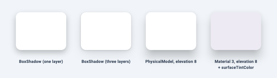
PhysicalModel draws the shadow with Canvas.drawShadow, then fills its shape with color. drawShadow takes only a path, a colour and an elevation. The blur, offset and spread all follow from the elevation, so you can't tune them individually. In the screenshot above, the elevation 8 shadow is strongest below the card, lighter at the sides and almost absent above it.
Things to know:
- Defaults:
elevationis 0 (no shadow until you set it),shadowColoris opaque black, andclipBehaviorisClip.none. - Shapes:
shapeis aBoxShapewith an optionalborderRadius. For any other outline,PhysicalShapetakes aCustomClipper<Path>instead. - It draws nothing without a child. The render object returns early when there is no child, so this paints no colour and no shadow, and it lays out at zero size:
const PhysicalModel(
  color: Colors.white,
  elevation: 8,
)
Give it a sized child, as in the first example, even if the child is an empty SizedBox.
Material elevation
Material doesn't have its own shadow code. When it has no shape and the default MaterialType.canvas, it builds an AnimatedPhysicalModel. With a borderRadius or shape, or as a Card, it builds a PhysicalShape clipped to its ShapeBorder. (MaterialType.transparency builds a plain clip and casts no shadow.) Either way the shadow comes from the same drawShadow call, which is why Material(elevation: 8) and PhysicalModel(elevation: 8) cast the same shadow in the screenshot.
What Material adds on top:
- A theme-based shadow colour. In Material 3 it defaults to
ColorScheme.shadow, which is black unless you change it. In Material 2 it isThemeData.shadowColor. - Animation. Changing
elevation,shadowColororsurfaceTintColoranimates overanimationDuration(200 ms by default). - Surface tint in Material 3.
Material 3: surface tint vs shadow
Material 3 can show elevation in two ways at once: a shadow below the surface, and a tint blended into the surface colour. They are controlled separately:
shadowColorsets the shadow.Colors.transparentremoves it.surfaceTintColorblends a colour overcolor, with an opacity that grows with elevation.nullorColors.transparentmeans no tint.
The defaults matter here. In current Flutter (this article was checked against 3.38), Material.surfaceTintColor defaults to null, and Card sets it to Colors.transparent. A widget test confirms a Material 3 Card builds with elevation 1, colour ColorScheme.surfaceContainerLow, no tint, and a black shadow. So in Material 3, elevation alone gives you a shadow and nothing else. Cards are told apart by their surface container colour instead of a tint.
If you want the tint back, set it explicitly:
Material(
  elevation: 8,
  color: Colors.white,
  borderRadius: BorderRadius.circular(16),
  // Optional, Material 3 only: tint the surface by elevation.
  surfaceTintColor: Theme.of(context).colorScheme.surfaceTint,
  child: const SizedBox(width: 160, height: 120),
)
The tint opacity comes from a fixed table in ElevationOverlay.applySurfaceTint, interpolated between entries:
| Elevation | 0 | 1 | 3 | 6 | 8 | 12 and above |
|---|---|---|---|---|---|---|
| Tint opacity | 0% | 5% | 8% | 11% | 12% | 14% |
To keep the tint and drop the shadow, for a flat Material 3 look:
Material(
  elevation: 8,
  color: Colors.white,
  shadowColor: Colors.transparent, // keep the tint, drop the shadow
  surfaceTintColor: Theme.of(context).colorScheme.surfaceTint,
  borderRadius: BorderRadius.circular(16),
  child: const SizedBox(width: 160, height: 120),
)
Why your shadow looks wrong
It's cut off at the edges
Something above the widget is clipping, and a shadow, drawn outside its widget, is the first thing to go. The usual suspects:
- Scroll views.
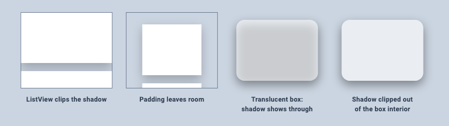
ListView,GridView,PageViewandSingleChildScrollViewdefault toclipBehavior: Clip.hardEdge, and they apply it once their content is bigger than the viewport, which for a real list is almost always. A widget test shows a list that fits on screen leaves the shadows alone, while the same items in an overflowing list are cut off at its left and right edges. - Explicit clips:
ClipRRect,ClipPath, and anyMaterial,CardorContainerwith aclipBehaviorset. These clip whatever is inside them, including the shadows of their children.
Leave room for the shadow inside the clip. Using the reach table above:
Widget shadowedItem() => Container(
  height: 100,
  margin: const EdgeInsets.only(bottom: 16),
  decoration: const BoxDecoration(
    color: Colors.white,
    boxShadow: [BoxShadow(color: Color(0x40000000), blurRadius: 16, offset: Offset(0, 8))],
  ),
);
ListView(
  // 3 sigma of blurRadius 16 is ~29 px; the 8 px offset moves it down.
  padding: const EdgeInsets.fromLTRB(32, 24, 32, 40),
  children: [for (var i = 0; i < 10; i++) shadowedItem()],
)
Setting the list's clipBehavior to Clip.none also removes the cut, but then items scrolling past the edge of the list stay visible outside it.
A translucent box shows its own shadow
BoxDecoration paints the shadow first and the fill on top. With an opaque fill you never see the part of the shadow underneath. With a translucent one, typical for glass-style cards, it shows through as a grey patch:
Container(
  width: 160,
  height: 120,
  decoration: BoxDecoration(
    color: Colors.white.withValues(alpha: 0.6),
    borderRadius: BorderRadius.circular(16),
    boxShadow: const [
      BoxShadow(color: Color(0x66000000), blurRadius: 16, offset: Offset(0, 8)),
    ],
  ),
)
The fix is to clip the inside of the box out of the shadow. A small painter does it: build a path that covers everything around the box but not the box itself (the even-odd fill rule turns the inner rounded rectangle into a hole), clip to it, then draw the shadow:
class OutsideShadowPainter extends CustomPainter {
  const OutsideShadowPainter({required this.radius, required this.shadow});
  final double radius;
  final BoxShadow shadow;

  @override
  void paint(Canvas canvas, Size size) {
    final box = RRect.fromRectAndRadius(Offset.zero & size, Radius.circular(radius));
    final reach = shadow.blurSigma * 3 + shadow.offset.distance + shadow.spreadRadius.abs();
    // Everything around the box, but not the box itself.
    final outside = Path()
      ..fillType = PathFillType.evenOdd
      ..addRect((Offset.zero & size).inflate(reach))
      ..addRRect(box);
    canvas.save();
    canvas.clipPath(outside);
    canvas.drawRRect(box.shift(shadow.offset).inflate(shadow.spreadRadius), shadow.toPaint());
    canvas.restore();
  }

  @override
  bool shouldRepaint(OutsideShadowPainter oldDelegate) =>
      oldDelegate.radius != radius || oldDelegate.shadow != shadow;
}
Put it behind the translucent box and remove the boxShadow from the decoration:
CustomPaint(
  painter: const OutsideShadowPainter(
    radius: 16,
    shadow: BoxShadow(color: Color(0x66000000), blurRadius: 16, offset: Offset(0, 8)),
  ),
  child: Container(
    width: 160,
    height: 120,
    decoration: BoxDecoration(
      color: Colors.white.withValues(alpha: 0.6),
      borderRadius: BorderRadius.circular(16),
    ),
  ),
)
BlurStyle.outer ("nothing inside, fuzzy outside") is documented in dart:ui for this case. In a widget test, though, a rounded box with BlurStyle.outer rendered with a solid rectangle in its middle, so check it on your target devices before relying on it.
It disappears in dark mode
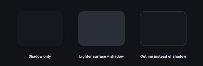
A black shadow on a near-black background has almost nothing to darken. That's not a Flutter bug, and ColorScheme.shadow is still black in the default Material 3 dark scheme. The usual fixes are visual:
- Make raised surfaces lighter. Material 3 dark themes already do this through colour roles: in the default dark scheme,
surfaceContainerLowis lighter thansurface, andsurfaceContainerHighis lighter again.CardusessurfaceContainerLow. - Use an outline (
ColorScheme.outlineVariantis a good start) where the shadow was the only thing separating two surfaces. - In Material 2,
ThemeData.applyElevationOverlayColorlightens surface-colouredMaterialby elevation in dark themes. It is off by default in a Material 2ThemeData(unless you build it from acolorSchemeSeed), so turn it on if you rely on it.
It's missing in golden tests
flutter_test sets debugDisableShadows = true, which replaces blurred shadows with solid shapes. Set it to false at the start of a golden test and back to true before the test ends, or the test fails its post-test checks.
Which one should you use?
- Matching a design with offset, blur and spread values, or layering several shadows:
BoxShadowon aBoxDecorationorShapeDecoration. - A Material surface that should follow the theme and animate when its elevation changes:
MaterialorCardwithelevation. - An elevation shadow for a custom path without the rest of Material:
PhysicalShapewith aCustomClipper<Path>. - A translucent surface: a
BoxShadowpainted with the inside of the box clipped out.
If you want to try layered BoxShadow values side by side before putting them in code, the shadow generator previews them and outputs the Dart list.
Related articles
Explore Our Projects
Beyond the shape tools — two more things we build and use every day. Free to try, no signup.
Keyboard Arena
Typing practice that plays like a game
Real-time WPM tests, mechanical switch audio, A-Z finger drills and 40+ structured lessons. Race a ghost of your best run instead of grinding random words.
- ✓ Live WPM & Accuracy
- ✓ Mechanical Switch Audio
- ✓ 40+ Guided Lessons
Flutter Log Explorer
Finally, Flutter logs you can read
Zero-config, real-time log capture from the Debug Adapter and Dart VM Service, with smart classification, filters and deduplication — all inside VS Code.
- ✓ Zero-Config Capture
- ✓ Smart Filters & Search
- ✓ Noise-Free Deduplication
Ready to Design Your Own Shapes?
Open the editor and start creating professional Flutter CustomPainter code visually.
Open the Editor