Convert an SVG Path to a Flutter Path by Hand
An SVG <path> and a Flutter Path describe shapes the same way: a pen that moves, draws lines and curves, and closes shapes. Most SVG commands map one-to-one onto a Path method. The few that don't (H, V, S, T, and the flags on A) are exactly where hand conversions go wrong.
Knowing the mapping lets you drop a 24 × 24 icon into a CustomPainter without a package, animate individual points, and debug a converter's output when a curve comes out wrong. This guide covers every command, then converts a real Material icon and checks the result pixel by pixel against the icon font.
The command table
Uppercase commands use absolute coordinates. Lowercase commands are relative to the current point, the end of the previous segment, and Flutter has a relative... method for most of them.
| SVG | Meaning | Flutter (uppercase, absolute) | Flutter (lowercase, relative) |
|---|---|---|---|
M x y |
Move to | moveTo(x, y) |
relativeMoveTo(dx, dy) |
L x y |
Line to | lineTo(x, y) |
relativeLineTo(dx, dy) |
H x |
Horizontal line | lineTo(x, currentY) |
relativeLineTo(dx, 0) |
V y |
Vertical line | lineTo(currentX, y) |
relativeLineTo(0, dy) |
C x1 y1 x2 y2 x y |
Cubic Bézier | cubicTo(x1, y1, x2, y2, x, y) |
relativeCubicTo(...) |
S x2 y2 x y |
Smooth cubic | cubicTo(reflected, x2, y2, x, y) |
relativeCubicTo(...) |
Q x1 y1 x y |
Quadratic Bézier | quadraticBezierTo(x1, y1, x, y) |
relativeQuadraticBezierTo(...) |
T x y |
Smooth quadratic | quadraticBezierTo(reflected, x, y) |
relativeQuadraticBezierTo(...) |
A rx ry rot large sweep x y |
Elliptical arc | arcToPoint(...) |
relativeArcToPoint(...) |
Z or z |
Close | close() |
close() |
For relative curves, Flutter measures every argument from the current point, control points included, which is the same rule SVG uses for lowercase commands. So c1 2 3 4 5 6 becomes relativeCubicTo(1, 2, 3, 4, 5, 6) with no arithmetic.
A few rules of the path syntax you need to read real-world paths:
- Repeated commands can drop the letter.
L10 10 20 20is two lines. AfterM, extra coordinate pairs are treated asL(and afterm, asl). - A minus sign also separates numbers.
10-4.48is10followed by-4.48. Compact icon paths rely on this, including the one in the worked example below. HandVneed the current point. Flutter has no horizontal-line method, so for absoluteHandVyou have to remember the current x or y yourself. The relative forms are easy:h20isrelativeLineTo(20, 0).
After Z, the current point is the start of the subpath
SVG defines the current point after Z as the point where that subpath started, so a following m or l is measured from there. Flutter does the same. A test with moveTo(10, 10), two lines, close(), then relativeMoveTo(5, 5) starts the next contour at (15, 15), not at the last point drawn. relativeLineTo right after close() also starts from (10, 10). You can translate these commands literally.
S and T: reflected control points
S and T are shorthand for "continue smoothly". They omit the first control point and imply it: it is the previous segment's last control point, reflected through the current point.
/// S and T: the implied control point is the previous one reflected through
/// the current point.
Offset reflect(Offset control, Offset current) => current * 2 - control;
Reflection puts the two control points on one straight line through the shared point, which is what makes the join smooth (the tangent at a curve's end points towards its neighbouring control point, see how Bézier curves work).
The rules for which control point to reflect:
| Command | Reflect | If the previous command was something else |
|---|---|---|
S / s |
the second control point of the previous C, c, S or s |
the first control point is the current point |
T / t |
the control point of the previous Q, q, T or t (including one that was itself implied) |
the control point is the current point, so the segment is a straight line |
Rendering M 20 60 T 180 60 in a browser draws a straight line, and Q 100 100 180 160 T 340 160 draws a symmetric wave, as these rules predict. The relative forms still need this absolute bookkeeping: reflect in absolute coordinates, then subtract the current point if you want to pass the result to relativeCubicTo.
A: arcs and the two flags
SVG's arc command is A rx ry x-axis-rotation large-arc-flag sweep-flag x y. Flutter's arcToPoint takes the same information as named arguments:
/// SVG: A rx ry x-axis-rotation large-arc-flag sweep-flag x y
void svgArc(
  Path path,
  double rx,
  double ry,
  double xAxisRotation,
  int largeArcFlag,
  int sweepFlag,
  double x,
  double y,
) {
  path.arcToPoint(
    Offset(x, y),
    radius: Radius.elliptical(rx, ry),
    rotation: xAxisRotation, // degrees in both
    largeArc: largeArcFlag == 1,
    clockwise: sweepFlag == 1,
  );
}
Given a start point, an end point and a radius, there are usually two possible ellipses and two ways around each, so four arcs. The flags pick one:
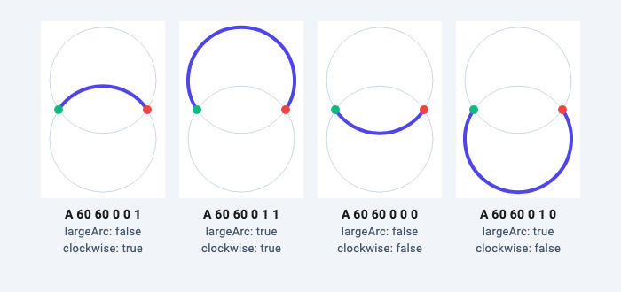
sweep-flag = 1 maps to clockwise: true. SVG defines sweep 1 as the "positive angle" direction. With the y axis pointing down, positive angles turn clockwise on screen, and Flutter's clockwise also means clockwise on screen. A test draws all four combinations from (0, 50) to (100, 50) with radius 60 and measures the result with PathMetric. The highest point of A 60 60 0 0 1 is y = 23.17 and of A 60 60 0 1 1 is y = −43.17, both above the chord; with sweep 0 the arcs bulge below it to y = 76.83 and 143.17. Those are the values the SVG definition predicts for circles centred 33.17 px above and below the chord.
Two more details that match SVG, both confirmed by the arcToPoint documentation and a test:
rotationis in degrees, like SVG's x-axis-rotation. An arc with radii 50 × 25 is 25 px tall atrotation: 0and 100 px tall atrotation: 90(the radii get scaled up, see the next point).- Radii that are too small are scaled up.
arcToPoint(Offset(100, 0), radius: Radius.circular(10))from (0, 0) draws a 50 px radius semicircle, the smallest that fits, instead of failing.
Lowercase a maps to relativeArcToPoint(Offset(dx, dy), ...) with the same flags.
One trap if you check your work with Path.getBounds(): its documentation notes that curves contribute their implied control points, which can sit outside the arc. For the small arc above it reports a top of −25.4 instead of 23.17. Sample the path with computeMetrics() when you need the true extent.
Worked example: Material's check_circle icon
Here is the check_circle icon from Material Design Icons, on its standard 24 × 24 viewBox:
M12 2C6.48 2 2 6.48 2 12s4.48 10 10 10 10-4.48 10-10S17.52 2 12 2z
m-2 15l-5-5 1.41-1.41L10 14.17l7.59-7.59L19 8l-9 9z
It uses absolute and relative curves, an implicit repeated s, both s and S reflections, a relative move after z, and minus signs as separators. Walk through it keeping track of the current point and the last control point:
| SVG | Current point before | Work | Flutter call |
|---|---|---|---|
M12 2 |
moveTo(12, 2) |
||
C6.48 2 2 6.48 2 12 |
(12, 2) | last control (2, 6.48) | cubicTo(6.48, 2, 2, 6.48, 2, 12) |
s4.48 10 10 10 |
(2, 12) | reflect (2, 6.48) → (2, 17.52); add (2, 12) to the rest | cubicTo(2, 17.52, 6.48, 22, 12, 22) |
10-4.48 10-10 (repeated s) |
(12, 22) | reflect (6.48, 22) → (17.52, 22) | cubicTo(17.52, 22, 22, 17.52, 22, 12) |
S17.52 2 12 2 |
(22, 12) | reflect (22, 17.52) → (22, 6.48) | cubicTo(22, 6.48, 17.52, 2, 12, 2) |
z |
current point is now (12, 2) | close() |
|
m-2 15 |
(12, 2) | (12 − 2, 2 + 15) | moveTo(10, 17) |
l-5-5 then 1.41-1.41 |
(10, 17) | two relative lines | lineTo(5, 12), lineTo(6.41, 10.59) |
L10 14.17 |
lineTo(10, 14.17) |
||
l7.59-7.59 |
(10, 14.17) | lineTo(17.59, 6.58) |
|
L19 8, l-9 9, z |
lineTo(19, 8), lineTo(10, 17), close() |
As code, with the original command next to each call:
// M12 2C6.48 2 2 6.48 2 12s4.48 10 10 10 10-4.48 10-10S17.52 2 12 2z
// m-2 15l-5-5 1.41-1.41L10 14.17l7.59-7.59L19 8l-9 9z
Path checkCircleIcon() {
  return Path()
    // Outer circle
    ..moveTo(12, 2) //                              M12 2
    ..cubicTo(6.48, 2, 2, 6.48, 2, 12) //           C6.48 2 2 6.48 2 12
    ..cubicTo(2, 17.52, 6.48, 22, 12, 22) //        s4.48 10 10 10
    ..cubicTo(17.52, 22, 22, 17.52, 22, 12) //      (s) 10-4.48 10-10
    ..cubicTo(22, 6.48, 17.52, 2, 12, 2) //         S17.52 2 12 2
    ..close() //                                    z
    // Check mark
    ..moveTo(10, 17) //                             m-2 15  (from 12,2)
    ..lineTo(5, 12) //                              l-5-5
    ..lineTo(6.41, 10.59) //                        (l) 1.41-1.41
    ..lineTo(10, 14.17) //                          L10 14.17
    ..lineTo(17.59, 6.58) //                        l7.59-7.59
    ..lineTo(19, 8) //                              L19 8
    ..lineTo(10, 17) //                             l-9 9
    ..close(); //                                   z
}
You can also keep the relative commands relative. The reflected control point has to be expressed relative to the current point (for the first s: (2, 17.52) − (2, 12) = (0, 5.52)), but the rest is copied straight from the SVG:
Path checkCircleIconRelative() {
  return Path()
    ..moveTo(12, 2)
    ..cubicTo(6.48, 2, 2, 6.48, 2, 12)
    ..relativeCubicTo(0, 5.52, 4.48, 10, 10, 10)
    ..relativeCubicTo(5.52, 0, 10, -4.48, 10, -10)
    ..cubicTo(22, 6.48, 17.52, 2, 12, 2)
    ..close()
    ..relativeMoveTo(-2, 15)
    ..relativeLineTo(-5, -5)
    ..relativeLineTo(1.41, -1.41)
    ..lineTo(10, 14.17)
    ..relativeLineTo(7.59, -7.59)
    ..lineTo(19, 8)
    ..relativeLineTo(-9, 9)
    ..close();
}
A test checks both versions with Path.contains on a 48 × 48 grid of points across the icon, and they agree everywhere.
Why the tick is a hole
The circle is traced counter-clockwise on screen and the check mark the other way (a test computes the signed area of each contour: about −314 for the circle, π × 10², and +36 for the tick). SVG's default fill-rule is nonzero, and so is Flutter's default PathFillType, so regions where the two contours overlap with opposite directions cancel out and the tick shows the background. Keep the point order exactly as in the SVG and this carries over automatically. If an icon uses fill-rule="evenodd", set path.fillType = PathFillType.evenOdd; even-odd vs non-zero explains the difference.
Checking the result
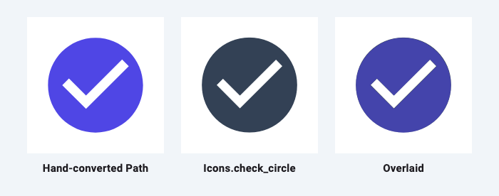
A widget test renders the hand-converted path at 192 × 192 next to Icon(Icons.check_circle, size: 192) from the Material Icons font and compares the two masks pixel by pixel. They overlap with an intersection-over-union of 0.992, and 137 of 36,864 pixels differ (0.37%).
Scaling from the viewBox
The path above is in viewBox units (0 to 24). To draw it at any size, scale it with a Matrix4. SVG's default preserveAspectRatio is xMidYMid meet: scale uniformly until the viewBox fits, then centre it. This does the same, including viewBoxes that don't start at (0, 0):
import 'dart:math' as math;

import 'package:flutter/material.dart';

/// Scales a path drawn in an SVG viewBox to fit [size], keeping its aspect
/// ratio and centring it (SVG's default preserveAspectRatio="xMidYMid meet").
Path fitViewBox(Path path, Rect viewBox, Size size) {
  final scale = math.min(size.width / viewBox.width, size.height / viewBox.height);
  final dx = (size.width - viewBox.width * scale) / 2 - viewBox.left * scale;
  final dy = (size.height - viewBox.height * scale) / 2 - viewBox.top * scale;
  final matrix = Matrix4.translationValues(dx, dy, 0)..scaleByDouble(scale, scale, 1, 1);
  return path.transform(matrix.storage);
}
Tests confirm a 24 × 24 square lands at (24, 0)–(72, 48) in a 96 × 48 box, centred horizontally, and that a viewBox of -12 -12 24 24 maps onto (0, 0)–(48, 48). Matrix4.scaleByDouble is used because the older scale method is deprecated in the vector_math version Flutter 3.38 ships, and flutter analyze reports it.
A painter then needs only a few lines:
class SvgIconPainter extends CustomPainter {
  SvgIconPainter({required this.path, required this.color, this.viewBox = const Rect.fromLTWH(0, 0, 24, 24)});

  final Path path;
  final Color color;
  final Rect viewBox;

  @override
  void paint(Canvas canvas, Size size) {
    canvas.drawPath(fitViewBox(path, viewBox, size), Paint()..color = color);
  }

  @override
  bool shouldRepaint(SvgIconPainter oldDelegate) =>
      oldDelegate.path != path || oldDelegate.color != color || oldDelegate.viewBox != viewBox;
}
Use it as CustomPaint(painter: SvgIconPainter(path: checkCircleIcon(), color: Colors.green)) inside a sized box.
Stroked icons: path.transform vs canvas.scale
Line icons are often stroked, for example with stroke-width="2" on a 24-unit viewBox, and the stroke should scale with the icon. The two ways of scaling behave differently here:
| Approach | Stroke width 2, icon drawn 4× larger |
|---|---|
path.transform(...), then drawPath |
2 px: only the geometry is scaled |
canvas.scale(4), then drawPath |
8 px: everything drawn afterwards is scaled |
Both rows come from a test that strokes a horizontal line and counts the covered pixels. With path.transform, multiply the stroke width by the scale yourself.
Common mistakes
- Treating lowercase as absolute. If a converted shape is in the right place for a few segments and then flies off, look for a lowercase letter you translated as uppercase.
- Reflecting the wrong point for S. It's the second control point of the previous cubic, not the first.
- Forgetting the repeated command.
s4.48 10 10 10 10-4.48 10-10is two curves, not one with extra numbers. - Inverting sweep.
sweep-flag = 1isclockwise: true. Don't flip it to compensate for the y axis; both systems already point y down.
Automating it
Converting by hand is practical for an icon or two. For larger artwork, the SVG Path Importer parses a d attribute and outputs the same kind of Path code, and knowing the rules above makes its output easy to read and adjust.
Related articles
Explore Our Projects
Beyond the shape tools — two more things we build and use every day. Free to try, no signup.
Keyboard Arena
Typing practice that plays like a game
Real-time WPM tests, mechanical switch audio, A-Z finger drills and 40+ structured lessons. Race a ghost of your best run instead of grinding random words.
- ✓ Live WPM & Accuracy
- ✓ Mechanical Switch Audio
- ✓ 40+ Guided Lessons
Flutter Log Explorer
Finally, Flutter logs you can read
Zero-config, real-time log capture from the Debug Adapter and Dart VM Service, with smart classification, filters and deduplication — all inside VS Code.
- ✓ Zero-Config Capture
- ✓ Smart Filters & Search
- ✓ Noise-Free Deduplication
Ready to Design Your Own Shapes?
Open the editor and start creating professional Flutter CustomPainter code visually.
Open the Editor