Flutter Bottom Navigation Bar with a Curved FAB Notch
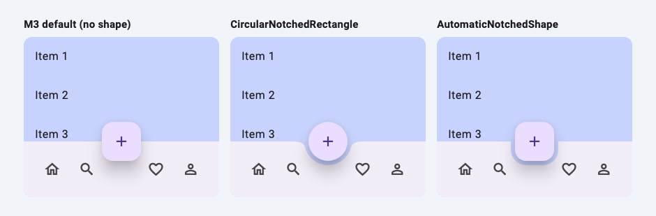
A bottom bar with a floating action button sitting in a curved cut-out is a common app layout, and Flutter supports it out of the box: BottomAppBar accepts a NotchedShape, and the Scaffold tells it where the FAB is. Under Material 3 a few defaults changed, so code from older tutorials often produces no notch, a square button in a round hole, or a bar with no shadow.
This recipe covers the built-in shapes first, then a custom NotchedShape with a smoother, wider curve. All the behaviour below was checked in Flutter 3.38 with Material 3, which ThemeData uses by default.
The built-in recipe
class NotchedBarScreen extends StatelessWidget {
  const NotchedBarScreen({
    super.key,
    this.shape = const CircularNotchedRectangle(),
    this.fabShape = const CircleBorder(),
  });

  final NotchedShape? shape;
  final ShapeBorder? fabShape;

  @override
  Widget build(BuildContext context) {
    return Scaffold(
      extendBody: true, // let the body show through the notch
      body: ListView.builder(
        itemCount: 20,
        itemBuilder: (context, i) => ListTile(title: Text('Item ${i + 1}')),
      ),
      floatingActionButton: FloatingActionButton(
        shape: fabShape, // the M3 default is a rounded square
        onPressed: () {},
        child: const Icon(Icons.add),
      ),
      floatingActionButtonLocation: FloatingActionButtonLocation.centerDocked,
      bottomNavigationBar: BottomAppBar(
        shape: shape,
        notchMargin: 6,
        child: Row(
          mainAxisAlignment: MainAxisAlignment.spaceAround,
          children: [
            IconButton(icon: const Icon(Icons.home_outlined), onPressed: () {}),
            IconButton(icon: const Icon(Icons.search), onPressed: () {}),
            const SizedBox(width: 48), // keep the middle free for the FAB
            IconButton(icon: const Icon(Icons.favorite_border), onPressed: () {}),
            IconButton(icon: const Icon(Icons.person_outline), onPressed: () {}),
          ],
        ),
      ),
    );
  }
}
Four pieces work together:
FloatingActionButtonLocation.centerDockedputs the FAB's centre on the top edge of the bar. A widget test confirms the FAB centre's y equals the bar's top.endDocked,startDockedand theminiCenterDockedvariants do the same at other positions.BottomAppBar.shapeis theNotchedShapethat cuts the hole. The FAB has to be theScaffold'sfloatingActionButton: the bar reads the button's rectangle from the scaffold's geometry, and with no FAB the bar is drawn whole (a test withCircularNotchedRectangleand no FAB finds no notch).notchMarginis the gap around the button. In the SDK source the bar inflates the FAB's rectangle by this amount before passing it to the shape, so the shape never needs to know about the margin.extendBody: truelets the body run behind the bar, so content scrolls through the notch. In an 800 × 600 test theListViewis 600 px tall with it and 520 px without (the bar is 80 px).
What Material 3 changed
These come from the BottomAppBar and FloatingActionButton defaults in the SDK source, and the first four are also checked in widget tests:
| Material 3 default | What to do | |
|---|---|---|
| Bar shape | AutomaticNotchedShape(RoundedRectangleBorder()) with no guest shape, so no notch |
Set shape: yourself |
| FAB shape | RoundedRectangleBorder with 16 px corners |
Use CircleBorder() with a circular notch, or match the notch to the square |
| Bar height | 80 | Pass height: to change it |
| Shadow | elevation: 3 but shadowColor: Colors.transparent, so no visible shadow |
Pass shadowColor: (and an elevation:) to get one back |
| Colour | colorScheme.surfaceContainer |
Pass color: |
| Padding | 12 vertical, 16 horizontal | Pass padding: |
The shape you pass is used as-is under Material 3; it takes priority over the theme and the defaults. The most common surprise is the second row: CircularNotchedRectangle with an untouched Material 3 FAB gives a round hole around a rounded square. Either make the button round, as in the recipe above, or cut a notch the same shape as the button.
A notch that matches the rounded-square FAB
AutomaticNotchedShape subtracts one ShapeBorder (the guest) from another (the host). Give it a guest that matches the FAB:
/// Matches the M3 FAB (radius 16) plus notchMargin (6).
const roundedFabNotch = AutomaticNotchedShape(
  RoundedRectangleBorder(),
  RoundedRectangleBorder(borderRadius: BorderRadius.all(Radius.circular(22))),
);
The guest rectangle has already been grown by notchMargin, so for the notch's corners to run parallel to the button's, use the button's radius plus the margin: 16 + 6 = 22. That's the right-hand bar in the screenshot above. Under the hood, AutomaticNotchedShape calls Path.combine(PathOperation.difference, host, guest), the same technique the ticket card recipe uses for its side notches.
Why CircularNotchedRectangle looks tight
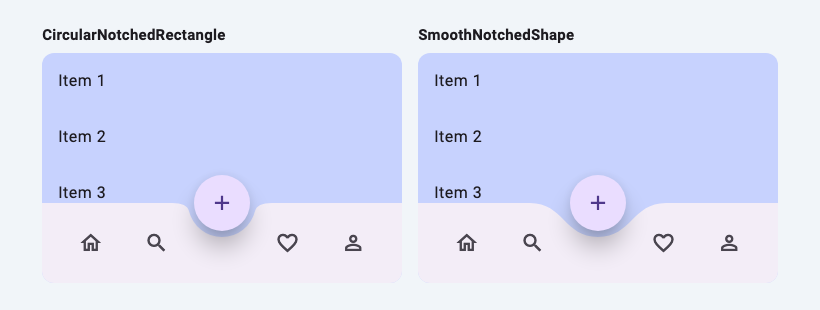
CircularNotchedRectangle builds its notch from three pieces: an arc that follows the button's circle, plus a short quadratic curve on each side that joins the arc to the bar's top edge. In the SDK source the size of those transitions is fixed (s1 = 15.0 and s2 = 1.0 pixels), whatever the size of the button. The result is a hole that hugs the FAB with small, fairly sharp shoulders.
Many designs want the opposite: a wide, soft dip that the button sinks into. For that you write your own NotchedShape.
A custom NotchedShape with a smooth curve
NotchedShape has one method. host is the bar's rectangle, and guest is the FAB's rectangle already inflated by notchMargin (or null when there is no FAB):
/// A notch that eases in and out of the bar with two cubic curves per side.
class SmoothNotchedShape extends NotchedShape {
  const SmoothNotchedShape();

  @override
  Path getOuterPath(Rect host, Rect? guest) {
    if (guest == null || !host.overlaps(guest)) {
      return Path()..addRect(host);
    }
    // guest is the FAB's rect already inflated by notchMargin.
    final r = guest.width / 2;
    final cx = guest.center.dx;
    final bottom = guest.center.dy + r;

    return Path()
      ..moveTo(host.left, host.top)
      ..lineTo(cx - 2 * r, host.top)
      ..cubicTo(cx - r, host.top, cx - r, bottom, cx, bottom)
      ..cubicTo(cx + r, bottom, cx + r, host.top, cx + 2 * r, host.top)
      ..lineTo(host.right, host.top)
      ..lineTo(host.right, host.bottom)
      ..lineTo(host.left, host.bottom)
      ..close();
  }
}
Use it by passing shape: const SmoothNotchedShape() to the BottomAppBar, for example NotchedBarScreen(shape: SmoothNotchedShape()).
How the curve is built
With r the radius of the inflated button:
- The dip starts
2rto the left of the button's centre and ends2rto the right, so it is4rwide: 136 px for a 56 px FAB with a 6 px margin. - Its lowest point is at
guest.center.dy + r, the bottom of the inflated circle. For a docked FAB that isrbelow the bar's top. - Each side is one cubic Bézier. Its first control point sits level with the bar's top edge and its second level with the bottom of the dip, both at
cx ± r.
Because a Bézier curve leaves its start point heading towards its first control point, and arrives at its end point from the direction of its last one, the curve is horizontal where it meets the flat top of the bar and horizontal again at the bottom of the dip. There are no corners anywhere in the outline. How Bézier curves work explains why.
Checking it clears the button
A curve that is wide and smooth can still clip into the button if the control points are wrong, so this layout was checked with a test rather than by eye. With a real Scaffold, a docked FAB and notchMargin: 6, the test reads the bar's actual clip path and checks 3,600 directions × 68 distances from the FAB's centre, every point closer than the FAB radius plus the margin. None of them is inside the bar. The test also confirms the bottom of the dip touches the margin circle and that the dip starts 2r from the centre. Moving the second control point inward (to cx ± 0.8r) makes the curve cut about 1.5% into the margin circle, which is why the control points sit at cx ± r.
One caveat: the shoulders are measured from host.top, so the shape assumes the button's centre is on the bar's top edge. That holds for every ...Docked location. If you move the FAB higher or lower, recheck the clearance.
Make room for the wider dip
The notch is wider than the one CircularNotchedRectangle cuts, so items near the middle of the bar end up on the sloping shoulders. BottomAppBar.clipBehavior defaults to Clip.none, so they aren't cut off, but they can look like they're floating over the dip. Widen the gap in the middle of the row, or use fewer items.
Getting the shadow back
The BottomAppBar paints its background with a PhysicalShape whose clipper is your notched path, so any shadow follows the notch. Under Material 3 the default shadow colour is transparent, so you need both properties:
| Property | Value to try |
|---|---|
elevation |
3 is the M3 default; 8 was the Material 2 default |
shadowColor |
Colors.black or Colors.black54 |
If you build a curved bar without BottomAppBar (for example a plain Container with a custom painter), you lose this, and a ClipPath around a shadowed widget will clip the shadow off. Why ClipPath removes your shadow shows the fixes, and BoxShadow vs PhysicalModel vs elevation compares the shadow options.
Summary
| Goal | Use |
|---|---|
| Round FAB, standard notch | CircularNotchedRectangle() + FloatingActionButton(shape: CircleBorder()) |
| Keep the M3 rounded-square FAB | AutomaticNotchedShape(RoundedRectangleBorder(), RoundedRectangleBorder(borderRadius: radius + notchMargin)) |
| Wide, smooth dip | A custom NotchedShape such as SmoothNotchedShape |
| Content visible through the notch | Scaffold(extendBody: true) |
| Shadow under M3 | BottomAppBar(shadowColor: ..., elevation: ...) |
Related articles
Explore Our Projects
Beyond the shape tools — two more things we build and use every day. Free to try, no signup.
Keyboard Arena
Typing practice that plays like a game
Real-time WPM tests, mechanical switch audio, A-Z finger drills and 40+ structured lessons. Race a ghost of your best run instead of grinding random words.
- ✓ Live WPM & Accuracy
- ✓ Mechanical Switch Audio
- ✓ 40+ Guided Lessons
Flutter Log Explorer
Finally, Flutter logs you can read
Zero-config, real-time log capture from the Debug Adapter and Dart VM Service, with smart classification, filters and deduplication — all inside VS Code.
- ✓ Zero-Config Capture
- ✓ Smart Filters & Search
- ✓ Noise-Free Deduplication
Ready to Design Your Own Shapes?
Open the editor and start creating professional Flutter CustomPainter code visually.
Open the Editor