Flutter vs Jetpack Compose vs SwiftUI: The Same Custom Shape in All Three
Flutter, Jetpack Compose and SwiftUI all describe custom shapes the same way: a Path with lines and curves. The differences are in everything around the path: making it reusable, keeping its shadow, limiting taps to it and animating it.
This article builds one curved header in all three frameworks and compares each step. Every snippet compiles with Flutter 3.38.7, Jetpack Compose UI 1.12.1 (BOM 2026.09.00, Kotlin 2.4.21) and SwiftUI from the Xcode 27.2 SDK, and the rendering and tap behaviour described below was checked in running code. The SwiftUI code compiles for iOS 15 and macOS 12 or later, and none of it is iOS-only.
The shape
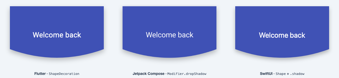
A rectangle whose bottom edge is a quadratic curve: the sides end at 75% of the height and the control point sits mid-width at 105%, so the curve's lowest point lands at 90%. It is the header from CustomPainter vs ClipPath vs ShapeBorder, plus a depth parameter (0.3 by default) for the animation section.
1. Defining the path
Flutter
Path curvedHeaderPath(Size size, {double depth = 0.3}) {
  final w = size.width;
  final h = size.height;
  return Path()
    ..moveTo(0, 0)
    ..lineTo(0, h * 0.75)
    ..quadraticBezierTo(w / 2, h * (0.75 + depth), w, h * 0.75)
    ..lineTo(w, 0)
    ..close();
}
Jetpack Compose
fun curvedHeaderPath(size: Size, depth: Float = 0.3f): Path {
    val w = size.width
    val h = size.height
    return Path().apply {
        moveTo(0f, 0f)
        lineTo(0f, h * 0.75f)
        quadraticTo(w / 2f, h * (0.75f + depth), w, h * 0.75f)
        lineTo(w, 0f)
        close()
    }
}
Older Compose tutorials use quadraticBezierTo. It was deprecated in Compose UI 1.7.0 in favour of quadraticTo, which matches the name of cubicTo. The arguments are the same.
SwiftUI
struct CurvedHeader: Shape {
    var depth: CGFloat = 0.3

    func path(in rect: CGRect) -> Path {
        let w = rect.width
        let h = rect.height
        var path = Path()
        path.move(to: CGPoint(x: 0, y: 0))
        path.addLine(to: CGPoint(x: 0, y: h * 0.75))
        path.addQuadCurve(
            to: CGPoint(x: w, y: h * 0.75),
            control: CGPoint(x: w / 2, y: h * (0.75 + depth))
        )
        path.addLine(to: CGPoint(x: w, y: 0))
        path.closeSubpath()
        return path.offsetBy(dx: rect.minX, dy: rect.minY)
    }
}
In SwiftUI a path naturally lives in a Shape, so the path and the reusable shape are one struct. path(in:) receives a CGRect rather than a size, so the path is moved to the rect's origin, the job .shift(rect.topLeft) does in a Flutter ShapeBorder.
Watch the argument order: Flutter and Compose take the control point first and the end point second. SwiftUI's addQuadCurve(to:control:) takes the end point first.
Coordinates and units
All three put the origin at the top-left corner with y growing downward. The units differ:
- Flutter works in logical pixels. The framework operates in logical pixels and scales by
devicePixelRatiowhen it renders, so a painter never converts anything. - Compose lays out in
dp, but theSizeinsideDrawScopeandShape.createOutlineis in pixels: "All drawing operations are performed using pixel sizing" (drawing docs). - SwiftUI works in points, so like Flutter there is nothing to convert.
This path uses fractions of the size, so units don't matter yet. They matter once you hard-code a value, such as a curve that is always 40 units deep. In Compose, convert it first:
// Inside DrawScope (Canvas, drawBehind), which is itself a Density:
val depthPx = 40.dp.toPx()

// Inside Shape.createOutline, use the density parameter:
val depthPx = with(density) { 40.dp.toPx() }
2. Drawing it
Flutter: CustomPainter
class HeaderPainter extends CustomPainter {
  HeaderPainter({required this.color});
  final Color color;

  @override
  void paint(Canvas canvas, Size size) {
    canvas.drawPath(curvedHeaderPath(size), Paint()..color = color);
  }

  @override
  bool shouldRepaint(HeaderPainter oldDelegate) => oldDelegate.color != color;
}

// Usage
SizedBox(
  height: 220,
  width: double.infinity,
  child: CustomPaint(painter: HeaderPainter(color: Colors.indigo)),
)
Compose: Canvas and DrawScope
val Indigo = Color(0xFF3F51B5)

@Composable
fun HeaderCanvas() {
    Canvas(Modifier.fillMaxWidth().height(220.dp)) {
        drawPath(curvedHeaderPath(size), color = Indigo)
    }
}
No class, no shouldRepaint: the lambda is the painter. Like Flutter's CustomPaint, a Canvas needs a size from its modifier. It is a wrapper around Modifier.drawBehind, which can draw the path behind any composable.
SwiftUI: a Shape is already a view
let indigo = Color(red: 0.25, green: 0.32, blue: 0.71)

CurvedHeader()
    .fill(indigo)
    .frame(height: 220)
No painter step at all. For imperative drawing, Canvas (iOS 15 / macOS 12 and later) hands you a GraphicsContext:
Canvas { context, size in
    let path = CurvedHeader().path(in: CGRect(origin: .zero, size: size))
    context.fill(path, with: .color(indigo))
}
.frame(height: 220)
3. A reusable shape that clips content
The harder case is putting a photo, or any other content, inside the curve.
Flutter: CustomClipper + ClipPath
class HeaderClipper extends CustomClipper<Path> {
  const HeaderClipper({this.depth = 0.3});
  final double depth;

  @override
  Path getClip(Size size) => curvedHeaderPath(size, depth: depth);

  @override
  bool shouldReclip(HeaderClipper oldClipper) => oldClipper.depth != depth;
}

ClipPath(
  clipper: const HeaderClipper(),
  child: Image.asset(
    'assets/mountains.jpg',
    height: 220,
    width: double.infinity,
    fit: BoxFit.cover,
  ),
)
Flutter uses separate classes around the same path: CustomPainter to draw, CustomClipper to clip, ShapeBorder when Material widgets need the outline.
Compose: Shape + Modifier.clip
class CurvedHeaderShape(private val depth: Float = 0.3f) : Shape {
    override fun createOutline(
        size: Size,
        layoutDirection: LayoutDirection,
        density: Density,
    ): Outline = Outline.Generic(curvedHeaderPath(size, depth))
}

Image(
    painter = painterResource(R.drawable.mountains),
    contentDescription = null,
    contentScale = ContentScale.Crop,
    modifier = Modifier
        .fillMaxWidth()
        .height(220.dp)
        .clip(CurvedHeaderShape()),
)
For a shape with no parameters, GenericShape saves the class:
val CurvedHeader = GenericShape { size, _ -> addPath(curvedHeaderPath(size)) }
One Shape object then works with Modifier.clip, Modifier.background(color, shape), Modifier.shadow and Modifier.dropShadow.
SwiftUI: .clipShape
Image("mountains")
    .resizable()
    .scaledToFill()
    .frame(height: 220)
    .clipShape(CurvedHeader())
The struct from step 1 needs no changes. The same CurvedHeader fills, clips and, as section 5 shows, defines the tappable area.
4. Shadows that follow the shape
Here the three diverge, and in each one the order of operations decides whether the shadow survives.
Flutter
ClipPath removes shadows, because a shadow is painted outside the shape and the clip discards everything outside (why, and three fixes). A short fix reuses the clipper:
PhysicalShape(
  clipper: const HeaderClipper(),
  color: Colors.indigo,
  elevation: 12,
  clipBehavior: Clip.antiAlias,
  child: const SizedBox(height: 220, width: double.infinity),
)
That gives Material elevation, not blur and offset. Exact shadow values need a ShapeBorder subclass plus a ShapeDecoration with a BoxShadow (blurRadius: 16, offset: Offset(0, 8) in the render at the top). The 20-line CurvedHeaderBorder and its Container are in the comparison article.
Compose
Compose has two shadow modifiers, and both take your Shape. Modifier.shadow is the elevation shadow, and it also clips the content to the shape by default (clip = elevation > 0.dp):
Modifier
    .fillMaxWidth()
    .height(220.dp)
    .shadow(elevation = 12.dp, shape = CurvedHeaderShape())
    .background(Indigo)
For blur radius, offset and spread, Modifier.dropShadow (Compose UI 1.9.0 and later) takes a Shadow. This is the Compose render at the top:
val shape = CurvedHeaderShape()

Modifier
    .fillMaxWidth()
    .height(220.dp)
    .dropShadow(
        shape = shape,
        shadow = Shadow(
            radius = 16.dp,
            color = Color(0x42000000),
            offset = DpOffset(x = 0.dp, y = 8.dp),
        ),
    )
    .background(Indigo, shape)
- Order matters. Put the shadow before any
clip. With.clip(shape).dropShadow(...)the shadow is clipped away, the same trap as Flutter'sClipPath. - Concave paths. The
Modifier.shadowdocs warn that a concave shape gets no shadow below Android 10. This header is convex, but a wave that dips inward would be affected.
SwiftUI
Text("Welcome back")
    .font(.system(size: 28))
    .foregroundStyle(.white)
    .frame(maxWidth: .infinity)
    .frame(height: 220)
    .background {
        CurvedHeader()
            .fill(indigo)
            .shadow(color: .black.opacity(0.26), radius: 8, y: 8)
    }
.shadow follows whatever the view draws, so a filled shape casts a curved shadow. Two placement rules:
- After
.clipShape, not before..clipShape(CurvedHeader()).shadow(...)gives a curved shadow;.shadow(...).clipShape(CurvedHeader())clips it away. - On the shape, not the stack. Applied to the whole view,
.shadowalso lands on the text. Putting it on the filled shape inside.backgroundavoids that.
5. Hit testing limited to the shape
The test in each framework: tap the empty corner under the curve, inside the box but outside the shape.
Flutter
RenderClipPath.hitTest returns false for points outside the path before testing its child. In a widget test the corner tap was ignored whether the GestureDetector sat inside the ClipPath or wrapped it (default hit-test behaviour):
ClipPath(
  clipper: const HeaderClipper(),
  child: GestureDetector(
    onTap: onTap,
    child: Container(height: 220, color: Colors.indigo),
  ),
)
A Container with a ShapeDecoration also ignores the corner. A CustomPaint background does not: every point in its box is a hit unless you override CustomPainter.hitTest.
Compose
@Composable
fun TappableHeader(onTap: () -> Unit) {
    Box(
        Modifier
            .fillMaxWidth()
            .height(220.dp)
            .clip(CurvedHeaderShape()) // clip first...
            .clickable(onClick = onTap) // ...so only the curve is clickable
            .background(Indigo)
    )
}
Modifier.clip affects more than drawing: a clickable after it in the chain only receives touches inside the shape. Swap them to .clickable { }.clip(...) and the corner counts again. Modifier.shadow clips by default, so a clickable after it is limited too. All three cases were checked with an instrumented UI test on an Android emulator.
SwiftUI
indigo
    .frame(height: 220)
    .clipShape(CurvedHeader())
    .contentShape(CurvedHeader())
    .onTapGesture(perform: onTap)
.clipShape changes what is drawn, not what is tappable: with .clipShape alone, a corner click still fired onTapGesture in a test on macOS. .contentShape "defines the content shape for hit testing"; adding it made the corner ignored. A filled Shape used as the view itself (CurvedHeader().fill(indigo)) ignored the corner without .contentShape.
6. Animating the curve depth
Animate depth from 0 (a flat bottom edge) to 0.3.
Flutter
TweenAnimationBuilder<double>(
  tween: Tween(end: curved ? 0.3 : 0.0),
  duration: const Duration(milliseconds: 300),
  builder: (context, depth, child) =>
      ClipPath(clipper: HeaderClipper(depth: depth), child: child),
  child: Container(height: 220, color: Colors.indigo),
)
Each frame builds a new HeaderClipper, and shouldReclip returns true because depth changed, so the clip updates.
Compose
@Composable
fun AnimatedHeader(curved: Boolean) {
    val depth by animateFloatAsState(
        targetValue = if (curved) 0.3f else 0f,
        label = "curve depth",
    )
    Box(
        Modifier
            .fillMaxWidth()
            .height(220.dp)
            .clip(CurvedHeaderShape(depth))
            .background(Indigo)
    )
}
A Shape is a plain value, so animating it means creating a new one from the animated number.
SwiftUI
Add animatableData to the shape and change depth inside withAnimation:
struct CurvedHeader: Shape {
    var depth: CGFloat = 0.3

    var animatableData: CGFloat {
        get { depth }
        set { depth = newValue }
    }

    // path(in:) unchanged
}

struct AnimatedHeader: View {
    @State private var curved = true

    var body: some View {
        CurvedHeader(depth: curved ? 0.3 : 0)
            .fill(indigo)
            .frame(height: 220)
            .onTapGesture {
                withAnimation(.easeInOut(duration: 0.3)) { curved.toggle() }
            }
    }
}
Without animatableData the curve jumps straight to the new value. The default implementation "returns EmptyAnimatableData, meaning nothing is animated." Current SDKs also include an @Animatable macro that writes the property for you.
Side by side
| Flutter | Jetpack Compose | SwiftUI | |
|---|---|---|---|
| Quadratic curve | quadraticBezierTo(cx, cy, x, y) |
quadraticTo(cx, cy, x, y) |
addQuadCurve(to:control:) |
| Units inside the path | Logical pixels | Pixels (convert dp with toPx()) |
Points |
| Draw only | CustomPainter + CustomPaint |
Canvas / drawBehind |
Shape.fill or Canvas |
| Reusable outline | CustomClipper / ShapeBorder |
Shape / GenericShape |
Shape |
| Clip content | ClipPath |
Modifier.clip |
.clipShape |
| Shadow that follows the shape | PhysicalShape (elevation), ShapeDecoration + ShapeBorder (blur, offset) |
Modifier.shadow (elevation), Modifier.dropShadow (blur, offset) |
.shadow (blur, offset) |
| Shadow lost when | ClipPath wraps it |
clip comes first |
.shadow comes before .clipShape |
| Taps limited to shape | ClipPath yes, CustomPaint no |
Yes for clickable after clip |
Needs .contentShape (filled shape: yes) |
| Animating the curve | New clipper + shouldReclip |
New Shape per frame |
animatableData |
What's easier where
Flutter makes hit testing predictable: ClipPath limits taps whether the gesture detector sits inside or outside it, and logical pixels mean no unit conversion. The cost is boilerplate. Drawing, clipping and decorating are three classes, and a shadow with exact blur and offset takes a ShapeBorder subclass with five overrides or a custom shadow painter.
Compose reuses one object everywhere. A single Shape drives clipping, backgrounds and both shadow modifiers, and dropShadow gives designer-style shadows in one call. The trade-off is that modifier order carries meaning: swapping two modifiers can hide the shadow or make the corner clickable again. Drawing code also has to remember that sizes are in pixels.
SwiftUI needs little ceremony. The shape is a view, so one struct fills, clips and animates, and .shadow takes blur and offset directly. Its trap is the reverse of Compose's: .clipShape looks like it should limit taps but doesn't, so .contentShape has to be added by hand, and .shadow on a whole view also shadows its text.
None of this is a reason to pick a framework. The path code ports almost line for line; when porting, check the wrapper: where the clip goes, where the shadow goes and what defines the hit area.
Related articles
Explore Our Projects
Beyond the shape tools — two more things we build and use every day. Free to try, no signup.
Keyboard Arena
Typing practice that plays like a game
Real-time WPM tests, mechanical switch audio, A-Z finger drills and 40+ structured lessons. Race a ghost of your best run instead of grinding random words.
- ✓ Live WPM & Accuracy
- ✓ Mechanical Switch Audio
- ✓ 40+ Guided Lessons
Flutter Log Explorer
Finally, Flutter logs you can read
Zero-config, real-time log capture from the Debug Adapter and Dart VM Service, with smart classification, filters and deduplication — all inside VS Code.
- ✓ Zero-Config Capture
- ✓ Smart Filters & Search
- ✓ Noise-Free Deduplication
Ready to Design Your Own Shapes?
Open the editor and start creating professional Flutter CustomPainter code visually.
Open the Editor